
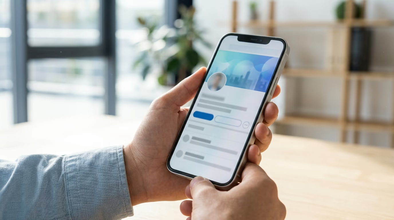
Your LinkedIn cover photo is the wide banner behind your profile picture, and it is the single largest piece of visual space you control on the whole platform. LinkedIn shows it at 1584 x 396 pixels across the top of your profile, yet most people leave the default blue gradient or upload a stock skyline that says nothing about who they are. That banner is free advertising space, and using it on purpose is one of the fastest upgrades you can make to your profile.
This guide covers what a good LinkedIn cover photo should communicate, concrete ideas by profession, the exact steps to change it on desktop and on your phone, the size and safe zone that keep it sharp, and the mistakes that get your image cropped or ignored. Every step matches how LinkedIn works right now, and the specs come straight from LinkedIn rather than from guesswork.
LinkedGrow is an AI LinkedIn content platform, so we spend our days studying what turns a profile visitor into a follower or a client. A cover photo never works alone. It sits above your headline and your recent posts, and the profiles that convert treat all three as one message. If you want the full picture, pair this with the LinkedIn personal branding guide so your banner, headline, and content all point in the same direction.
Why does your LinkedIn cover photo matter?
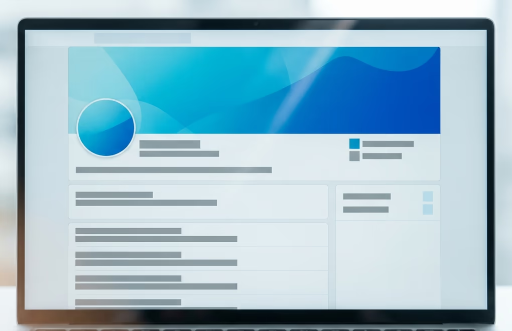
Your LinkedIn cover photo matters because it is the first large visual a profile visitor sees, and it sets the frame for every judgment they make in the next few seconds. Someone lands on your page, and before they read a single word of your About section, they have already absorbed the color, the tone, and whether your banner looks intentional or forgotten. That first impression carries into how they read everything else.
The banner also occupies prime real estate. It runs the full width of your profile, above your name and headline, on the one screen that every recruiter, prospect, and potential follower reaches when they check you out. When a recruiter opens your profile after seeing a post, or a buyer clicks through from a comment you left, the banner is doing quiet work whether you planned it or not. A blank one wastes the attention you already earned.
That attention usually arrives on the back of your content. When one of your posts does well, a good share of the people who read it click your name to find out who you are, and the banner is the first thing that greets them. For anyone who posts regularly, whether through LinkedGrow or by hand, the cover photo becomes the billboard that turns a one-time reader into a follower, so sending that warm traffic to a default blue banner is a small leak you never see. The people who saw your idea are right there, ready to learn more, and the banner is your chance to tell them where to go next.
There is a credibility angle too. A clean, on-message banner signals that you take your presence seriously, and that signal transfers to your work. The reverse does just as much damage, because a pixelated photo or the default background tells visitors you have not thought about your profile in a while, which is exactly the wrong message when someone is deciding whether to trust you, hire you, or follow along. If you are working through your whole profile, the LinkedIn profile optimization checklist shows how the banner fits alongside your headline, About section, and featured content.
What should you put on your LinkedIn cover photo?
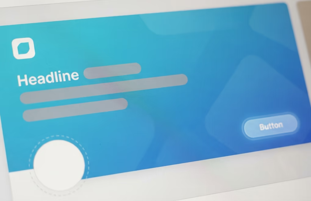
A LinkedIn cover photo should answer one question fast: who you help and what you do. The strongest banners carry a short value proposition, a hint of proof, and often a single call to action, laid out so nothing important sits behind the profile picture. Think of it as a billboard that a driver reads in two seconds, not a page they study.
Start with the message, because it carries the most weight of anything on the banner. One line that names your audience and the outcome you deliver does more than any stock image, something like "I help B2B founders turn LinkedIn into a pipeline" or "Fractional CFO for seven-figure agencies". That single sentence tells a visitor whether they are in the right place. Keep the wording tight, because at banner size a paragraph turns into noise and nobody reads it.
Give that message room to breathe by setting a clear hierarchy. Put the main line largest and roughly centered, keep any supporting text and logo smaller and off to one side, and leave the lower-left corner empty for your profile picture. A visitor should read the banner in a single glance and know your niche before they ever scroll, and that only happens when one element is obviously the star and everything else steps back to support it.
Then add a light layer of proof and a next step. Proof can be a client logo, a credential, a number you can stand behind, or a recognizable brand mark, and it works because it backs up the promise without shouting. The call to action should be soft and specific, a nudge like "Read my newsletter" or "DM me the word START" rather than a hard sell. Wrap all of it in colors that match your headshot and your content, so a visitor who saw your post in the feed recognizes the same look on your profile. Your LinkedIn headline and your banner should say complementary things, not the same thing twice.
What are the best LinkedIn cover photo ideas by profession?
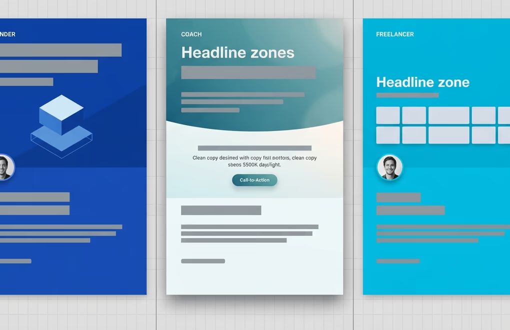
The best LinkedIn cover photo ideas depend on your role, because a founder, a coach, and a job seeker each need the banner to do a different job. The underlying rule stays the same, which is to make the message match what your ideal visitor wants to see, and then to remove everything that does not serve it.
Founders and SaaS builders do well with a banner that shows the product and states the mission in one line. A clean screenshot of the app next to "Helping remote teams ship faster" tells a visitor what you build and who it is for. Coaches and consultants get more from a transformation promise plus a booking nudge, because their buyers want proof of a result and a clear way to start. Something like "From burned-out manager to confident leader in 90 days" with a small "Book a call" prompt works better than a photo of a mountain.
Freelancers and ghostwriters should lead with the niche and a hint of the work, so a writer might use "Ghostwriting for B2B founders" alongside a strip of real post thumbnails. Sales and business development professionals get the most from framing the value to the buyer rather than to themselves, which means the banner talks about the outcome a client gets, not the quota you carry. Agencies can feature a row of client logos or a headline result, and job seekers are usually best served by a calm, on-brand banner that names the role and the strengths they bring, without a desperate "open to work" splashed across the whole image. Real-world examples for one niche live in the LinkedIn guide for real estate agents, and the same thinking maps onto any field.
A few more roles are worth calling out. Recruiters do well when the banner speaks to candidates, naming the kind of company and the roles they fill, since the whole point is to make the right person feel seen. Creators and thought leaders often skip the hard pitch entirely and use the banner for their theme or their newsletter, so a visitor immediately knows what they will get by following. Whatever your role, treat the first banner as a draft rather than a final answer. Watch how your profile visits and follows move after you change it, and adjust the wording the way you would test a hook on a post. If you already run your posts through LinkedGrow, apply the same habit to the banner and let the numbers tell you which message lands.
How do you change your LinkedIn cover photo?
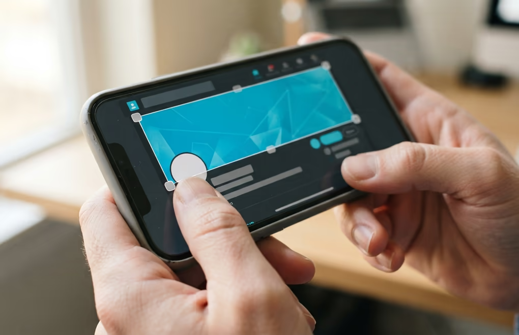
To change your LinkedIn cover photo, open your profile, click the camera or edit icon on the banner, upload your image, adjust the position, and save. The flow is slightly different on desktop and in the mobile app, but both take under a minute once your image is ready.
On a computer, click the Me icon at the top of LinkedIn and choose View profile. Click the camera icon in the top-right corner of your intro section, then pick Upload photo to add a new image or Choose image to use one LinkedIn suggests. You can crop, reposition, and zoom before you commit, and then you click Apply. If a banner already exists, the same corner shows an edit icon that lets you change or delete it. LinkedIn also offers a Create slideshow option here, though that rotating banner is a Premium feature.
In the mobile app, tap your profile photo and then tap it again to open your full profile. Tap the camera icon in the top-right of the intro area, upload a photo from your library or pick a suggested one, drag to set the position, and tap Save. The steps mirror the desktop version, so you can update your banner from your phone in seconds when you are away from your computer. Before you upload, it helps to know the exact dimensions, which the LinkedIn banner size guide lays out in full, including safe zones and design specs.
If the camera icon is missing on your phone, update the app or switch to a browser, where the banner controls are always available. To remove a banner rather than replace it, open the same edit menu and choose Delete, which returns you to the default background. One habit saves a lot of frustration: preview your profile on a phone right after you save, because the desktop editor shows the full canvas while the mobile feed is where the tighter crop actually happens.
What size should a LinkedIn cover photo be?
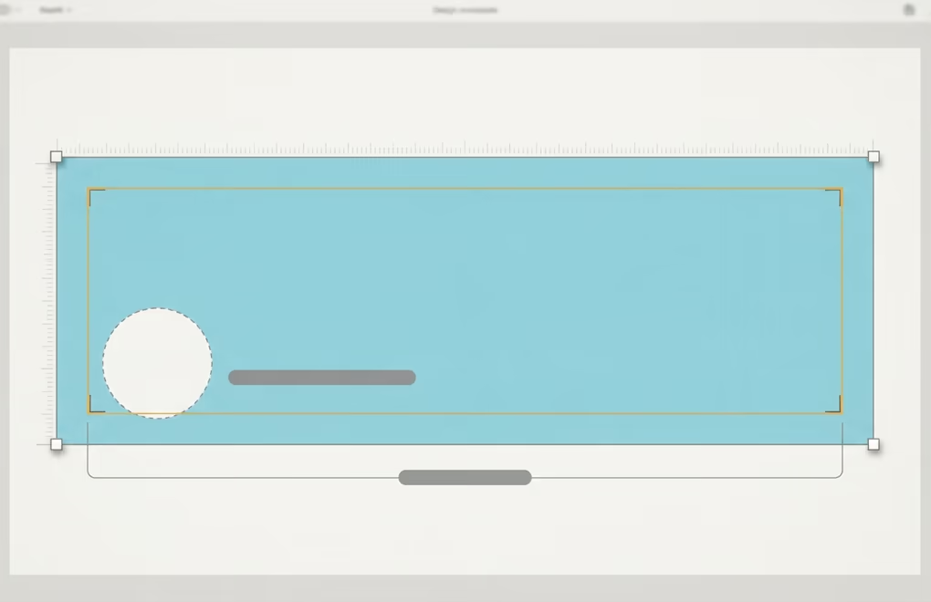
A LinkedIn cover photo should be 1584 x 396 pixels, a 4:1 ratio, saved as a JPG or PNG under 8 MB. Upload at that exact size so LinkedIn does not stretch a smaller image or compress a heavier one, and use PNG when your banner has text or sharp edges and JPG when it is mostly a photograph. A GIF only shows its first frame as a static image, so motion is not an option on a personal profile.
The part most people miss is the safe zone. LinkedIn crops the left and right edges differently on mobile than on desktop, and your profile picture covers the bottom-left corner of the banner. Keep your text, logo, and any call to action inside the central band, roughly the middle 1260 x 300 pixels, and away from that lower-left corner. Anything you push to the edges risks getting trimmed on a phone, which is where a large share of your visitors will actually see it.
If you want every LinkedIn image size in one place, LinkedGrow's free LinkedIn image sizes reference covers the banner, profile picture, post images, and carousels together, so you do not have to hunt for each one separately.
What LinkedIn cover photo mistakes should you avoid?
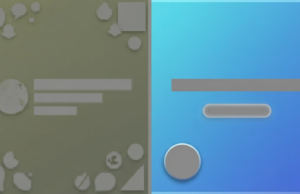
The most common LinkedIn cover photo mistakes are low-resolution images, text placed where the crop or the profile picture hides it, and a busy design that fights your face instead of supporting it. Each one is easy to fix once you know to look for it, and fixing them is often the difference between a banner that helps and one that quietly hurts.
Resolution is the first thing to get right. A small image stretched to fill the banner turns soft and blocky, and that blur reads as careless the moment someone lands on your page. Export at the full 1584 x 396 pixels, and if your file climbs over 8 MB, save the JPG at around 85 percent quality to bring it down without any visible loss. The second fix is placement, and it trips up even careful designers. Text and logos crammed into the corners get cut off on mobile or buried under your headshot, so pull every important element into the center where it survives on every screen.
Clutter is the last trap, and the hardest one to resist. A banner stuffed with three taglines, a headshot, five icons, and a QR code gives a visitor nothing to focus on, and a crowded design at this size looks amateur even when each piece is nice on its own. One clear message with a single supporting element and room to breathe beats a busy collage every time. Generic stock skylines fall into the same bucket, since a city photo with no words tells a visitor nothing about you.
One quieter mistake is leaving a good banner up long after it stops being true. A cover photo that still promotes a webinar from last spring or an offer you no longer run tells visitors your profile is on autopilot, so treat the banner as a live piece of your marketing rather than a set-and-forget decoration. A quick review every few months is enough to catch anything stale, and swapping it when your role or offer changes also gives regular visitors a reason to notice that you are active and paying attention.
To make one, set a custom 1584 x 396 canvas in any design tool, drop in a simple background, and add your line of text and logo inside the safe zone. If you would rather not source or shoot a background, LinkedGrow's AI image generation feature can create a clean, on-brand background image for your banner and your posts using your own API key, which keeps the cost to a few dollars a month. It fits the same content workflow you use for the rest of your LinkedIn presence, and you can try LinkedGrow free for 7 days and cancel in one click if it is not for you.
The whole thing comes down to treating your LinkedIn cover photo as the free ad space it is. Give it one clear message about who you help, back it with a little proof, add a soft call to action, keep everything sharp and inside the safe zone, and refresh it whenever your offer changes. Do that and your banner starts pulling its weight next to your profile picture and your posts, turning more of the visitors your content earns into followers and conversations.
Frequently Asked Questions
A LinkedIn cover photo should be 1584 x 396 pixels, which is a 4:1 ratio, saved as a JPG or PNG under 8 MB. Upload at that exact size so LinkedIn does not stretch or compress it, and keep your text and logo inside the central area, because the edges get cropped differently on mobile and the bottom-left corner sits behind your profile picture.
You cannot upload a video as your personal profile banner, and a GIF only shows its first frame as a static image. LinkedIn does offer a Create slideshow option for the cover area, but that rotating format is a Premium feature. For everyone else a single well-designed static image is the format that works, so most people are better off making one strong banner than chasing motion.
Your profile picture is the small circular headshot of your face, and your LinkedIn cover photo is the wide banner behind it. The headshot builds recognition and trust, while the banner carries your message, your positioning, and often a call to action. They work as a pair, so the banner should reinforce what your headshot and headline already say rather than repeat them.
Update your LinkedIn cover photo whenever your offer, role, or positioning changes, and review it at least once a year even if nothing major has shifted. A banner that still promotes an old service or a finished campaign quietly undercuts your credibility. Refreshing it also gives regular profile visitors a reason to notice that you are active and paying attention to your presence.
You can make a LinkedIn cover photo for free in any design tool that lets you set a custom canvas of 1584 x 396 pixels, then add a background, your text, and a logo inside the safe zone. Start from a blank banner rather than a busy template, keep the wording short, and export as a high-quality JPG or PNG. LinkedGrow's AI image generation can also create a clean background image for you using your own API key.
The post you keep meaning to write takes four minutes here.
LinkedGrow turns a link, a video or a rough idea into a LinkedIn post written in your own voice, then puts it in the calendar for the morning your audience is awake.
Start free for 7 days