LinkedIn carousel posts consistently outperform every other content format on the platform. Every swipe a reader makes generates dwell time, which is one of the strongest ranking signals in LinkedIn's algorithm. A 10-slide carousel holds attention for 15 to 20 seconds on average, compared to 3 to 5 seconds for a text post someone skims and scrolls past. Despite that performance gap, fewer than 2 percent of LinkedIn posts use the carousel format, which makes it a wide-open opportunity for creators and businesses that start using it consistently.
This guide covers the 10 LinkedIn carousel templates that drive the highest engagement, real examples with actual engagement numbers, the exact technical specs you need, hook formulas for carousel content, and design principles that keep people swiping to the last slide. Whether you use LinkedGrow's carousel generator or design your own in Canva or PowerPoint, these templates give you a proven starting point for every carousel you create.
Why do carousels outperform every other LinkedIn format?
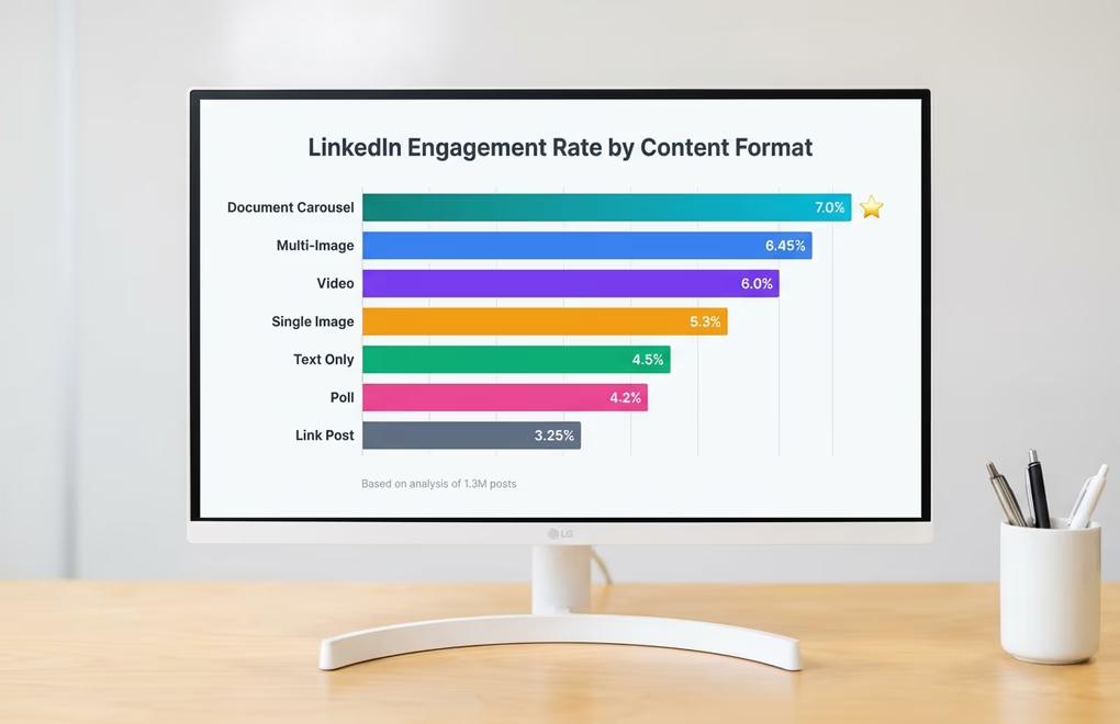
Document-style carousels, uploaded as PDFs that render as swipeable slides, earn the highest engagement rate of any post format on the platform. The numbers hold whether you are looking at company pages with millions of followers or individual creators with a few thousand connections. LinkedIn has moved toward using dwell time as a primary ranking signal, and each swipe registers as a micro-interaction that tells the algorithm this person is actively choosing to consume more content. That signal is much stronger than a quick like or a brief skim, which is why the algorithm pushes carousels harder than text or single-image posts.
There is also a psychological mechanism working in your favor. When someone starts swiping, they have made a small commitment, and each subsequent swipe reinforces it. Smart carousel creators use this by placing their most valuable insight on slide 7 or 8 rather than slide 2, because by that point the reader is committed and the dwell time is already strong enough to trigger wider distribution. The save rate on carousels is worth paying attention to as well: frameworks, checklists, and step-by-step guides in carousel format generate dramatically more saves than the same content presented as text, because the visual slide format feels like a resource worth coming back to.
Which 10 carousel formats drive the most engagement?
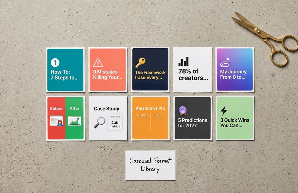
Not all carousels are created equal, and the format you choose shapes every aspect of how people interact with your content. After studying thousands of high-performing LinkedIn carousels, these are the 10 formats that consistently earn the strongest engagement, organized by what they do best.
Educational How-To Guides
This is the single highest-performing carousel format on LinkedIn. Each slide teaches one step of a process, and the reader swipes through the complete workflow from start to finish. The key to making these work is keeping each slide focused on exactly one action or concept - the moment you try to fit two ideas on a single slide, the clarity drops and so does the swipe-through rate. A carousel titled "How to write a LinkedIn hook in 7 steps" where each slide covers one step with a clear heading and 25 to 40 words of explanation is the template that performs most reliably across every niche and audience size.
Numbered Tips and Listicles
Numbered content taps into the same psychology that makes BuzzFeed headlines work - the specific number in the title creates an expectation that the reader wants to complete. "9 mistakes killing your LinkedIn engagement" or "12 tools I use to create content in half the time" set a clear promise that each swipe delivers one more item from the list. These carousels earn high save rates because people treat them as reference lists they can revisit later, especially when the tips are specific and actionable rather than vague advice.
Frameworks and Cheat Sheets
If you want saves, this is your format. A carousel that presents a reusable framework, a decision matrix, a checklist, or a cheat sheet feels like a free resource that the reader would normally pay for. "The content calendar framework I use every week" or "My LinkedIn hook formula cheat sheet" generate saves at rates that blow other formats out of the water because they provide lasting utility. The most effective versions name the framework something memorable so people associate it with you, turning a single carousel into a brand-building asset.
Data and Statistics Compilations
One bold statistic per slide with minimal supporting text creates a punchy, shareable carousel that positions you as someone who stays on top of the data. These work best when the statistics are surprising, counterintuitive, or directly relevant to your audience's daily work. A carousel titled "LinkedIn engagement data that will change how you post" with each slide featuring one eye-opening number and a one-sentence insight earns shares because people want to pass along the data to their own network.
Storytelling and Journey Posts
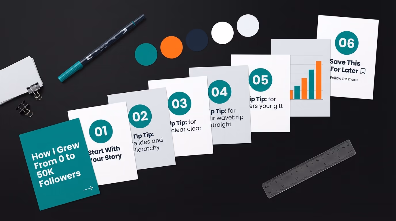
Personal narratives with clear milestones translate beautifully into carousel format because the slide structure naturally mirrors the progression of a story - beginning, middle, and end. "6 months ago I had 200 followers. Here is what changed." Each slide covers one chapter of the journey with a specific lesson or turning point. These generate the highest comment rates of any carousel format because people relate to the struggle and want to share their own experiences.
Before and After Comparisons
Visual transformation pairs are inherently engaging because they create an immediate sense of progress and possibility. Show a LinkedIn profile before and after optimization, a post hook before and after rewriting, or content metrics before and after applying a specific strategy. The contrast does the persuading for you - readers see the gap between the two states and instantly want to know how to close it for themselves.
Case Studies With Real Numbers
A carousel that walks through a real example - the challenge, what was tried, what worked, and the measurable result - carries more credibility than any amount of abstract advice. Structure it as: slide 1 is the hook with the headline result, slides 2-3 set up the problem, slides 4-7 walk through the approach, and slides 8-9 show the outcome with specific numbers. These take more effort to create but they build trust faster than any other format because they prove you are speaking from experience.
Comparison Posts
"Amateur vs Pro," "2020 LinkedIn vs 2026 LinkedIn," "What I thought success looked like vs what it actually is." Comparison carousels work because they create self-identification - readers immediately see themselves on one side of the comparison and feel motivated to move toward the other. Each slide pairs one "wrong" approach with its "right" counterpart, and the format naturally generates comments from people saying which camp they fall into.
Prediction and Trend Analysis
Forward-looking carousels that share your perspective on where an industry or platform is heading spark conversation because everyone has an opinion about the future. "5 LinkedIn trends that will define content creation next year" invites agreement, disagreement, and additions, which is exactly the kind of multi-threaded discussion the algorithm rewards most heavily.
Quick Wins and Micro-Lessons
Each slide delivers one small, immediately applicable insight that the reader can use right now. "5 LinkedIn settings most people forget to change" or "Quick fixes for your LinkedIn profile that take under 2 minutes." These earn shares because they feel helpful without demanding a time investment from the person sharing them.
What do high-performing LinkedIn carousel posts look like?

The best way to understand what works is to look at real carousels that earned real numbers. Here are four LinkedIn carousel examples from different niches, each using a different template from the list above, along with what made them perform.
Semrush's "SEO Checklist for 2026" used the numbered tips format across 12 slides, each covering one audit step with a single sentence and a bold icon. The carousel collected over 1,200 reactions and 180 comments because each tip was specific enough to be actionable on its own, and commenters tagged colleagues who needed to see particular slides. The takeaway: carousels that are useful slide-by-slide, not just as a whole, generate tagging behavior that multiplies reach.
Teachable's creator economy report turned survey data into a data compilation carousel, placing one statistic per slide with a short interpretation underneath. It earned over 400 reposts because each slide worked as a standalone screenshot people could share in group chats and Slack channels. Data carousels perform best when every slide is self-contained, since people rarely share the full deck - they screenshot the one number that surprised them.
beehiiv's Valentine's Day campaign used a storytelling format with 8 slides built around a single theme, earning 85 reactions, 21 comments, and 10 reposts from a relatively small following. What worked was the emotional hook on slide 1 paired with a consistent visual template that made every slide feel connected. For smaller accounts, these engagement-per-follower ratios are often better than what text posts deliver, because the carousel format levels the playing field by keeping people in the post longer.
A SaaS founder's "5 mistakes I made scaling to $1M ARR" followed the case study format, with each slide covering one mistake, what it cost, and what they did instead. The carousel pulled 600+ comments because the mistakes were specific and relatable, and nearly every commenter shared their own version of the same error. Personal failure stories in carousel format consistently outperform the same stories told as text posts, because the structured slide-by-slide reveal creates tension that a wall of text doesn't.
What technical specs do LinkedIn carousels require?

Getting the technical details right prevents the frustrating experience of creating a great carousel only to have it look blurry, cropped incorrectly, or difficult to read on someone's phone. The specs matter because LinkedIn renders document carousels differently from regular images, and designing with the wrong dimensions means your text might get cut off or your visual hierarchy might collapse on mobile screens where the majority of your audience is viewing.
The LinkedIn carousel post size that works best is 1080 by 1350 pixels in portrait (4:5) orientation, which gives you the best mobile experience. This gives you maximum screen real estate on phones, which is where most people will encounter your carousel. Square format at 1080 by 1080 also works well and is slightly easier to design for, but portrait takes up more vertical space in the feed which means your carousel pushes other content out of view and commands more attention. Upload as a PDF for the smoothest rendering - LinkedIn handles PDFs more reliably than PPTX or DOCX files, and the slide transitions feel more polished. Keep your file size under 3 megabytes to avoid compression artifacts that make text blurry. Note that single-image posts use different dimensions than carousels - the LinkedIn post image size guide covers the exact pixels for every feed image format. For a quick reference of every LinkedIn image dimension in one place, check the LinkedIn image sizes guide.
Slide count matters more than most people realize. The sweet spot is 8 to 12 slides. Carousels with fewer than 5 slides generate noticeably less reach because there is simply not enough content to build meaningful dwell time - the algorithm does not get a strong enough signal to justify pushing the post wider. On the other end, you can go past 12 slides if the content genuinely warrants it, but each additional slide past 12 needs to earn its place because reader drop-off accelerates as the carousel gets longer. The most common structure for a high-performing carousel is a hook slide, 8 to 10 content slides with one idea each, and a closing CTA slide.
Typography on carousel slides follows different rules than web or print design because people are reading on small screens while scrolling quickly. Use a minimum of 48-point text for headings and 24-point for body text when designing on a 1080-pixel canvas. Keep the word count between 25 and 50 words per slide - enough to convey one complete thought but not so much that the slide feels dense (the LinkedIn character counter helps you stay inside that range without drafting in a separate doc). Leave at least 80 pixels of padding on all sides to create a safe zone that prevents important content from being clipped by LinkedIn's rendering margins. And add a subtle right-pointing arrow or "swipe" indicator on the right edge of your first few slides to reduce the drop-off between slide 1 and slide 2, because some readers do not instinctively know the content is swipeable.
How to create a LinkedIn carousel post (step by step)
LinkedIn does not have a dedicated carousel builder inside the platform. Instead, you create your slides somewhere else, save them as a multi-page PDF, and upload that file as a document post - LinkedIn then renders it as the swipeable carousel everyone sees in the feed. That means the question of how to post a carousel on LinkedIn always comes down to two stages: build the slides, then upload the PDF. Here are the three methods that cover every skill level and budget.
Method 1: Upload a PDF document
Once your slides are saved as a single PDF, posting the carousel itself takes under a minute. Open the LinkedIn post composer, click the document icon (it usually sits behind the "Add a document" or "+" menu), and select your PDF file. LinkedIn asks you to give the document a title - this title shows above the carousel in the feed, so write something specific and benefit-driven rather than leaving it as the raw file name. Add your caption above the carousel, double-check the first slide thumbnail looks sharp in the preview, and publish. The carousel will appear as swipeable slides with page indicators, and every swipe a reader makes feeds the dwell-time signal that drives distribution.
Method 2: Build slides in Canva or PowerPoint
Canva, Google Slides, Figma, and PowerPoint all work for designing the slides themselves. Set your canvas or page size to 1080 by 1350 pixels in portrait, design each slide with one idea, then export the whole deck as a PDF. In Canva you choose "Share, Download, PDF Standard"; in PowerPoint and Google Slides you use "Save as" or "Download" and pick the PDF option. The trade-off with these tools is that they were not built for LinkedIn, so you have to manage dimensions, branding consistency, and the swipe-indicator details manually on every slide. It is free and flexible, but it is the slowest of the three methods once you account for the design work.
Method 3: Use LinkedGrow's carousel generator
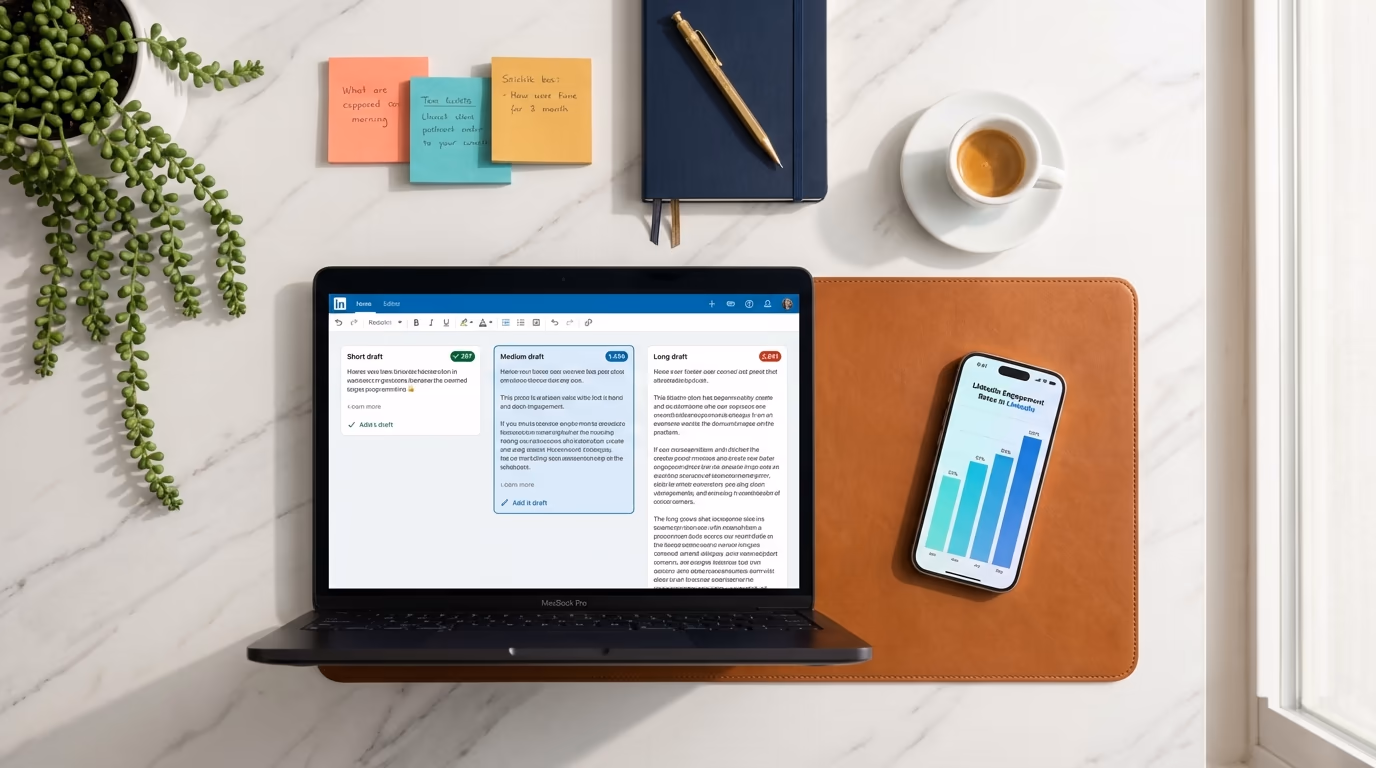
LinkedGrow's carousel generator removes the manual setup entirely. The canvas is already locked to LinkedIn carousel dimensions, the templates follow the one-idea-per-slide rule, and your brand colors, logo, and handle apply to every slide automatically. You pick a template, type or generate the text for each slide, and export a post-ready PDF in a few minutes - no dimension math, no design tools, no consistency checks. It is the fastest path from idea to a published LinkedIn carousel post, especially if you create carousels regularly rather than as a one-off.
Which hook formulas work best for LinkedIn carousels?
Your carousel's hook operates differently from a regular text post hook because it needs to do two things simultaneously: stop the scroll AND convince someone to start swiping. A text post hook just needs to earn the "see more" click, but a carousel hook needs to make the reader commit to an interactive experience. The good news is that carousels get a visual advantage in the feed because the first slide looks different from everything else around it, so you are already starting with more attention than a text post would get.
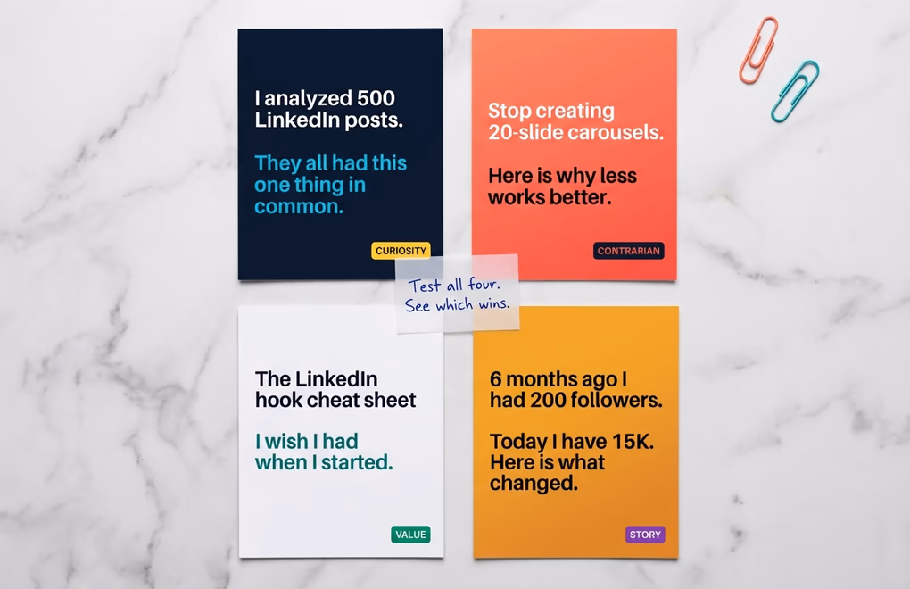
Curiosity hooks drive the highest swipe-through rates because they create an information gap the reader can only close by continuing. "I analyzed 500 LinkedIn posts. They all had this one thing in common." The specific number adds credibility, and the unresolved "this one thing" makes swiping feel necessary. Another version: "The framework behind every viral carousel. (It is not what you think.)" The parenthetical creates doubt about the reader's assumptions, which is a powerful motivator to keep going.
Value hooks generate the most saves because they promise something the reader will want to reference later. "The LinkedIn hook cheat sheet I wish I had when I started." "Learn to write carousels in 10 minutes. A visual guide." These work because they set an expectation of practical, reusable value - the reader knows before they start swiping that this carousel contains something worth keeping. LinkedGrow's hook generator creates multiple opening variations for any topic so you can test which approach resonates best with your specific audience.
Contrarian hooks earn the most comments because disagreement is one of the most powerful conversation starters on LinkedIn. "Stop creating 20-slide carousels. Here is why less works better." "The most popular carousel advice is wrong. Let me show you." These provoke responses from people who agree and people who disagree, which creates the multi-threaded comment discussions that the algorithm weighs most heavily when deciding distribution. Just make sure your contrarian take is backed by genuine reasoning in the slides that follow - a provocative hook that leads to weak content damages your credibility faster than a boring hook that leads to solid value.
Which design principles keep people swiping LinkedIn carousels?

You do not need to be a designer to create carousels that look professional, but you do need to follow a few principles that separate carousels people swipe all the way through from ones they abandon after slide 2. The most important principle is also the simplest: one idea per slide, no exceptions. The moment you put two concepts on a single slide, you force the reader to process multiple things at once, which breaks the smooth swiping rhythm that keeps them engaged. Think of each slide as a single sentence in a conversation, not a paragraph in an essay.
Visual consistency across all slides is what makes a carousel feel like a cohesive piece of content rather than a random collection of graphics. Pick one background color or gradient, one heading font, one body font, and one accent color, then use them on every slide without deviation. Your brand colors, logo, and handle should appear in the same position on every slide so that even when people screenshot and share individual slides, your identity travels with the content. LinkedGrow's carousel generator applies your branding settings automatically to every slide, so consistency is built into the workflow rather than something you have to enforce manually.
Contrast is what makes text readable on any background, and you need a minimum 4.5 to 1 contrast ratio between your text and background colors. Dark text on light backgrounds is the safest choice because it works in every lighting condition, including the bright outdoor sunlight that people are reading LinkedIn in during their commute. If you use colored backgrounds, test them at reduced brightness on your phone before publishing because what looks great on your calibrated desktop monitor can become unreadable on a dimmed phone screen. White or very light text on dark backgrounds works well too but requires more care - avoid thin font weights that disappear against dark colors.
The last slide of your carousel is prime real estate that too many creators waste. Your closing slide should have a clear call to action - follow for more, save this for later, comment with your experience, or visit a link in your bio. Do not just let the carousel end without asking for something, because readers who made it to the last slide are your most engaged audience members and they are the most likely to take action if you give them a specific next step. A simple "Found this useful? Save it for later and follow for more frameworks like this" converts passive swipers into active followers.
How do you create your first LinkedIn carousel today?
The biggest mistake people make with carousels is overthinking them. You do not need custom illustrations, animated transitions, or a design degree. You need one clear idea, 8 to 12 slides that each make one point, consistent branding, and a hook that earns the first swipe. Start with the easiest format - a numbered tips carousel on a topic you know well - and publish it. Your first carousel will not be perfect, and it does not need to be. What matters is that you start taking advantage of a format that the data consistently shows outperforms everything else on LinkedIn, while 98 percent of creators still are not using it.
If you want to skip the design learning curve entirely, LinkedGrow's carousel generator handles the visual side for you. Pick a template, customize the text, apply your brand colors and logo, and export a PDF that is ready to post. Before you publish, the LinkedIn post preview tool shows you exactly how the carousel and caption will render in the feed, and the LinkedIn post templates library gives you ready-to-customize copy frameworks for the caption itself. You can also generate AI images directly inside the editor to add original visuals to any slide. The entire process takes 15 to 20 minutes, and the result is a professional carousel that looks like you hired a designer - except you did not, and the whole thing cost you nothing beyond your LinkedGrow subscription.
Frequently Asked Questions
The sweet spot is 8 to 12 slides. Carousels with fewer than 5 slides see a significant drop in reach because there is not enough content to generate meaningful dwell time. Going past 15 slides works for highly detailed guides but risks drop-off if the content is not compelling enough to sustain attention through every swipe.
Use 1080 by 1350 pixels in portrait orientation for the best mobile experience, since most LinkedIn users browse on their phones. Square format at 1080 by 1080 pixels also works well. Upload your carousel as a PDF for the smoothest rendering, and keep the file size under 3 megabytes to avoid compression artifacts.
Yes, consistently. Document carousels earn the highest engagement rate of any LinkedIn format. The swipe interaction creates dwell time that the algorithm interprets as a strong positive signal, which leads to wider distribution. Despite this, fewer than 2 percent of LinkedIn posts use the carousel format, making it a significant opportunity.
Frameworks, checklists, and cheat sheets generate the most saves because people want to reference them later. If your carousel teaches a reusable process or provides a template readers can apply to their own work, they will save it. Educational how-to content and data compilations also earn high save rates.
Yes. LinkedGrow's carousel generator includes a visual editor with pre-built templates, drag-and-drop elements, custom branding, and PDF export built specifically for LinkedIn. You pick a template, customize the text and colors, and export a ready-to-post carousel without any design tools or experience.
PDF is the best format. LinkedIn renders PDF pages as swipeable slides with smooth transitions and sharp text. You can also upload PPTX or DOCX files, but PDFs produce the most consistent results across devices. Keep the file under 100 MB (LinkedIn's limit) and ideally under 3 MB to avoid compression artifacts that blur your text and graphics.
Open the LinkedIn post composer, click the three dots or the document icon labeled 'Add a document,' select your PDF file, and give it a title that appears above the carousel in the feed. Write your caption, preview the first slide thumbnail, and publish. LinkedIn converts each PDF page into a swipeable slide automatically. The document title is separate from your caption and shows as a clickable header, so make it specific and benefit-driven rather than a generic filename.