You have probably noticed that some LinkedIn posts grab your attention before you even read a single word. The text looks different - certain phrases are bold, some words appear in italic, and the spacing between sections creates a visual rhythm that pulls your eye down the page. Meanwhile your own posts land in the feed as a flat, unbroken wall of identical-looking text, and people scroll right past them. The difference is not talent or writing ability. It is formatting, and once you understand how to format LinkedIn posts with bold, italic, and spacing, your content will look noticeably more professional and readable in the feed.
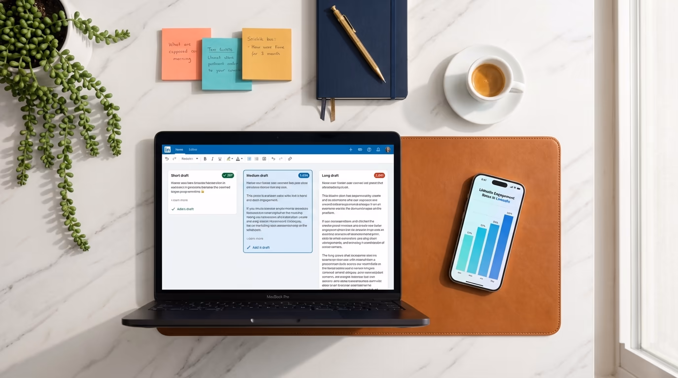
Here is the thing most people do not realize: LinkedIn's post composer has no formatting buttons whatsoever. There is no bold button, no italic toggle, no underline option. The platform only accepts plain text in regular posts. So how are people making their text look different? The answer involves a clever workaround using Unicode characters that were originally designed for mathematical equations, and tools like LinkedGrow's free LinkedIn text formatter that make the whole process as simple as typing and clicking a button.
This guide covers everything you need to know about LinkedIn post formatting in 2026 - how bold and italic actually work under the hood, the spacing and line break techniques that make your posts scannable, when emojis help versus when they hurt, how to format your hook for maximum "see more" clicks, and the accessibility considerations that most guides completely ignore. Whether you are a LinkedIn creator publishing daily or a professional who posts once a week, better formatting will make everything you write more effective.
How do bold and italic actually work on LinkedIn?
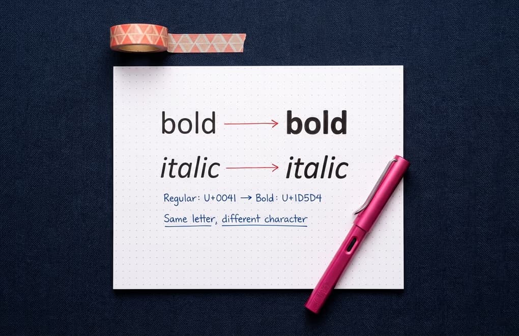
When you see bold text in a LinkedIn post, what you are actually looking at is a completely different set of characters from the Unicode Mathematical Alphanumeric Symbols block. These are characters that were originally created for academic papers and mathematical notation - they live in the Unicode range U+1D400 through U+1D7FF and include bold, italic, bold italic, script, double-struck, and several other visual variants of the standard Latin alphabet. Because they are real Unicode characters and not HTML formatting, they display anywhere that supports modern Unicode, including LinkedIn's plain text post field.
To give you a concrete example: the regular letter "A" that you type on your keyboard is Unicode code point U+0041. The bold version that shows up in formatted LinkedIn posts is actually U+1D5D4, a completely separate character called "Mathematical Sans-Serif Bold Capital A." Your eyes see it as a bold A, but to the computer they are as different as the letter A and the number 7. A formatting tool like LinkedGrow's text formatter simply swaps each letter you type for its mathematical equivalent, and the result looks like styled text when it appears in the LinkedIn feed.
The most commonly used styles for LinkedIn posts are Sans-Serif Bold and Italic, because they look closest to what you would expect from native formatting on a modern website. Other options like Script (which looks like handwriting), Fraktur (a gothic blackletter style), and Double-Struck (outline letters) are available but render inconsistently across devices, so they are better used sparingly or avoided entirely if you care about your post looking clean on every phone and laptop that encounters it.
One thing worth knowing is that LinkedIn Articles and Newsletters are completely different from regular posts when it comes to formatting. Articles have a full rich text editor with native bold, italic, underline, headers, lists, blockquotes, and code blocks built in. If you are publishing long-form content on LinkedIn, you get real formatting tools. But for the standard 3,000-character post that most people use daily, Unicode characters are the only option, and they will likely remain the only option until LinkedIn decides to add rich text to their post composer - something they have shown no signs of doing.
Which spacing and line break techniques make posts scannable?
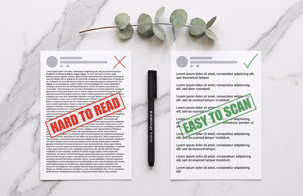
Bold and italic get the most attention when people talk about LinkedIn formatting, but spacing is honestly the more impactful technique because it determines whether someone actually reads your post or bounces after the first two seconds. A well-written post with no spacing looks like a dense paragraph from a textbook, and dense paragraphs trigger an immediate scroll-past response in a fast-moving feed where people are making split-second decisions about what deserves their time.
The core principle is simple: keep each paragraph to one or two lines maximum, and add a blank line between every paragraph. This creates the visual white space that makes your content feel approachable instead of intimidating. When someone sees short, digestible chunks of text separated by breathing room, their brain registers it as an easy read rather than a commitment - and that distinction alone determines whether they click "see more" or keep scrolling. Think about how you read text messages versus emails. LinkedIn posts should feel closer to the text message side of that spectrum.
There is a practical reason spacing matters beyond aesthetics: roughly 60 percent of LinkedIn users browse on mobile devices, and on a phone screen, three lines of desktop text become five or six lines. What looked like a reasonable paragraph on your laptop turns into a wall of text on someone's iPhone. Writing in short bursts with generous line breaks ensures your post looks clean on every screen size. If you are ever unsure whether your spacing is working, preview your post on your phone before publishing - and LinkedGrow's character counter shows you exactly where the "see more" cutoff falls so you can plan your spacing around it.
One quirk to be aware of is that LinkedIn sometimes collapses multiple consecutive blank lines into a single line break when your post renders in the feed. If you are trying to create large gaps between sections by hitting enter three or four times, the result might not look the way you intended. Stick to single blank lines between paragraphs for consistent, predictable spacing that works every time. Some people use special invisible Unicode characters to force extra spacing, but this is fragile and can break in unexpected ways across different devices and app versions.
When does emoji use help or hurt LinkedIn posts?
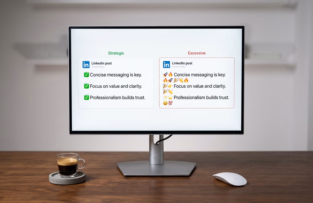
Emojis on LinkedIn sit at a strange intersection of personal expression and professional context, and the line between helpful and cringeworthy is thinner than most people think. Used strategically, one to three emojis per post can serve as visual anchors that break up text and draw the eye to key points. Used excessively, they make your content look like a group chat message that accidentally got posted to a professional network, and your audience's perception of your expertise drops accordingly.
The most effective way to use emojis is as structural markers rather than emotional decoration. Place a single relevant emoji at the beginning of a key point or section header to create a visual break that helps readers scan the post quickly. A checkmark, an arrow, a lightbulb, or a number emoji at the start of a line tells the reader "this is a distinct point" without requiring them to read the words first. This is fundamentally different from scattering heart-eyes and fire emojis throughout your sentences, which adds visual noise without adding meaning and signals that you are performing enthusiasm rather than communicating ideas.
Position matters too. Emojis work best at the beginning or end of a line, not embedded in the middle of a sentence. This is partly an aesthetic choice - mid-sentence emojis interrupt the reading flow - but it is also an accessibility consideration. Screen readers process emojis by announcing their description, so a fire emoji in the middle of a sentence becomes "the results were fire literally doubled our output" which is confusing to anyone using assistive technology. Placing emojis at line boundaries keeps your text readable for everyone.
One pattern you should avoid entirely is the emoji-reaction poll, where you ask people to "like for option A, comment for option B, share for option C." LinkedIn has explicitly flagged this as engagement bait and the algorithm penalizes it. It might look like a fun way to drive interaction, but the platform actively deprioritizes content that uses this pattern because it generates low-quality engagement that does not reflect genuine interest in the content. If you want people to respond to your post, ask a genuine question that invites a thoughtful reply instead.
How do you format hooks for maximum see-more clicks?
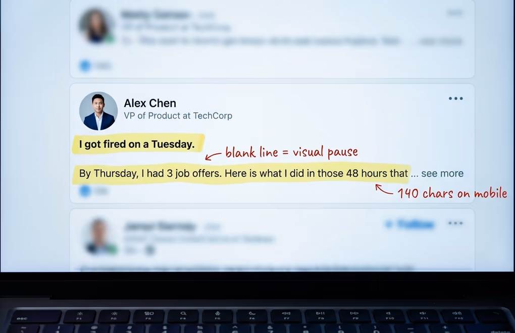
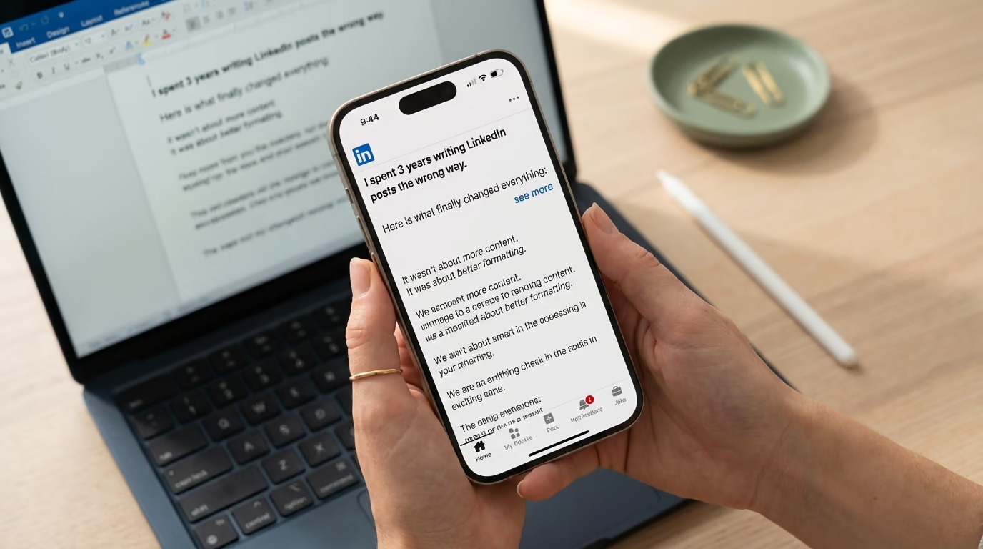
Everything we have covered so far matters most in the first two lines of your post, because that is all anyone sees before LinkedIn truncates your content with a "see more" button. On desktop, the preview shows approximately 210 characters before the cutoff. On mobile, it is closer to 140 characters. Those characters are the most valuable real estate in your entire post, and how you format them determines whether people read the rest or keep scrolling. Getting the hook right is half the battle of any LinkedIn post.
The most effective hook format uses a short, punchy first line followed by a blank line, then a second line that builds curiosity. The blank line after your first sentence is critical because it creates visual separation in the feed preview - your opening line stands alone rather than running into the next thought, which gives it more visual weight and makes it easier to process at a glance. Think of it like a newspaper headline followed by a subheadline. The first line stops the scroll, the blank line creates a pause, and the second line gives just enough information to make clicking "see more" feel irresistible.
Bold text in your hook can work well when used on a single phrase that carries the emotional weight of your opening, but avoid bolding your entire first line because it creates a visual heaviness that actually makes the text harder to read rather than easier. The power of bold comes from contrast - a bold phrase surrounded by regular text stands out, but an entirely bold paragraph just looks like someone is shouting. If you bold one key phrase in your hook, make it the specific detail that creates curiosity or surprise: a number, a timeframe, a result, or a counterintuitive claim.
One technique that works particularly well is ending your visible preview with an incomplete thought. If your second line ends right at the truncation point with something like "and the third one changed everything about how I..." the reader has no choice but to click "see more" to resolve the open loop. This is not manipulative - it is the same narrative tension that keeps people watching a show past the episode preview. The key is that the rest of your post actually delivers on the promise your hook creates, because readers who click "see more" and find weak content will engage less with your future posts. LinkedGrow's AI post generator creates hooks optimized for the truncation window and scores each post on its likelihood of earning the click.
Why does LinkedIn formatting break differently on mobile vs desktop?
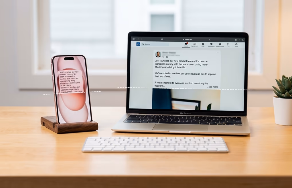
Most people compose their LinkedIn posts on a laptop and never check how they look on a phone, which is a problem when the majority of your audience is reading on a mobile screen. The free LinkedIn post preview tool shows you the desktop and mobile rendering side by side before you publish, so you catch the breaks that ruin a clean draft. The differences between desktop and mobile rendering are significant enough to break carefully crafted formatting, and understanding them prevents the frustrating experience of publishing what looked perfect on your computer only to see it fall apart in the mobile feed.
The most important difference is the "see more" truncation point. Desktop shows roughly 210 characters before the fold, while mobile shows around 140. That 70-character gap means a hook that works perfectly on desktop might get cut off mid-sentence on mobile, destroying the curiosity loop you carefully constructed. Always write your hook to work within the mobile limit of 140 characters, and treat anything between 140 and 210 as a bonus that desktop users will appreciate but that you cannot rely on.
Unicode formatted text generally renders correctly on both iOS and modern Android devices, but older Android phones can display certain Unicode characters as empty rectangles because their system fonts do not include the Mathematical Alphanumeric Symbols block. This affects a small but real percentage of your audience, and it is more common with decorative styles like Script, Fraktur, and Double-Struck than with standard Bold and Italic. If you want maximum compatibility, stick to Sans-Serif Bold for emphasis and regular Italic for secondary emphasis, and test any unusual Unicode styles on an Android device before using them in an important post.
Line length also behaves differently across devices. A single line on desktop can wrap to two or three lines on a phone, which means your carefully spaced paragraphs might look much longer on mobile than you intended. The safest approach is to write with mobile in mind from the start - if a paragraph looks right on a phone screen, it will look fine on desktop too, but the reverse is not always true. Before publishing anything, open LinkedIn on your phone and read through your draft to catch spacing issues, broken Unicode characters, or hooks that get truncated in the wrong place.
What is the accessibility trade-off of Unicode formatting?
There is an important downside to Unicode formatting that most LinkedIn formatting guides either skip entirely or mention as a footnote, and it deserves a proper discussion because it affects real people in your audience. Screen readers do not interpret Unicode mathematical characters as styled text - they announce the full technical Unicode name of each character. So when a screen reader encounters the word "growth" written in Unicode bold, it does not say "growth" in an emphasized voice. It says something like "mathematical sans-serif bold small g, mathematical sans-serif bold small r, mathematical sans-serif bold small o..." and so on for every single letter. For anyone using assistive technology, a heavily formatted post becomes completely unintelligible.
This does not mean you should stop formatting your posts entirely, but it does mean you should be thoughtful about how much formatting you apply and where you apply it. Bold one or two key phrases per post rather than entire sentences or paragraphs. Make sure the most important information in your post is written in plain text so that it is accessible to everyone regardless of how they consume content. Avoid formatting your hook in Unicode - the first two lines should always be plain text because they are the most critical part of your post and they need to work for every single reader.
There is also a search visibility consideration that connects to this. Unicode-formatted words are not indexed by LinkedIn's internal search the same way regular text is. If you write your job title or a key industry term in bold Unicode, someone searching for that exact term on LinkedIn will not find your post. Never format searchable keywords, names, or terms that people might use to discover your content. Save the formatting for phrases that add emphasis within the flow of your writing, not for the words that need to be discoverable. The accessibility and searchability limitations are real constraints, but they are easy to work within once you know about them, and the visual benefits of strategic formatting still make it worth doing for the majority of your audience.
How is post formatting a competitive advantage on LinkedIn?
Most LinkedIn users never think about formatting at all. They type their thoughts into the composer, hit publish, and hope for the best. That is actually good news for you, because it means that simply making your posts scannable and visually structured puts you ahead of the majority of content in your audience's feed. Bold a key takeaway, add breathing room between paragraphs, format your hook for the mobile truncation point, use one or two emojis as structural markers, and your post already looks more professional and readable than 90 percent of what surrounds it.
The indirect benefit that ties all of this together is dwell time. LinkedIn's algorithm weighs dwell time heavily when deciding how widely to distribute your content, and well-formatted posts keep people reading longer because the text is easier to consume. Every extra second someone spends on your post sends a positive signal to the algorithm, which shows it to more people, which generates more engagement, which triggers further distribution. Formatting does not just make your posts look better - it makes the algorithm work harder for you, and that compounds over every post you publish. If you want to start formatting your posts right now, LinkedGrow's free LinkedIn text formatter lets you type, style, and copy formatted text in seconds without leaving your browser.
Frequently Asked Questions
LinkedIn does not have a native bold or italic button in the post composer. The workaround uses Unicode Mathematical Alphanumeric Symbols - special characters that look like bold or italic text but are actually different Unicode code points. Formatter tools handle the conversion automatically so you just type normally and copy the styled result.
Formatting does not directly affect the algorithm because LinkedIn treats Unicode characters the same as regular text. However, well-formatted posts increase dwell time - how long people spend reading your content - which is one of the strongest algorithmic ranking signals. So formatting indirectly boosts your reach by keeping readers engaged longer.
Stick to one to three relevant emojis per post. Use them as visual anchors at the start of key points or sections, not as decoration scattered throughout. Overusing emojis makes your content look unprofessional and can distract from the message. Place emojis at the beginning or end of lines for better screen reader compatibility.
Older Android devices and some systems with limited font coverage cannot render Unicode Mathematical Alphanumeric Symbols and display empty rectangles instead. Stick to Bold and Italic styles which have the widest device support, and avoid decorative styles like Fraktur or Script which break more often on older hardware.
Screen readers announce Unicode mathematical characters by their full technical names rather than reading them as styled letters. This makes heavily formatted content difficult for visually impaired users. Keep Unicode formatting to key phrases only, never format entire paragraphs, and always write the most important information in plain text.