If you want to learn how to create LinkedIn carousels that get saved and shared, you are in the right place. The posts that rack up hundreds of saves, flood DMs with shares, and spread far beyond the poster's network almost always share one thing in common: they are carousels. Not polished video productions, not clever one-liners, and not even perfectly timed hot takes. Carousels - those swipeable, multi-slide document posts - have quietly become the highest-performing content format on LinkedIn, and the data in 2026 backs that up in a big way.
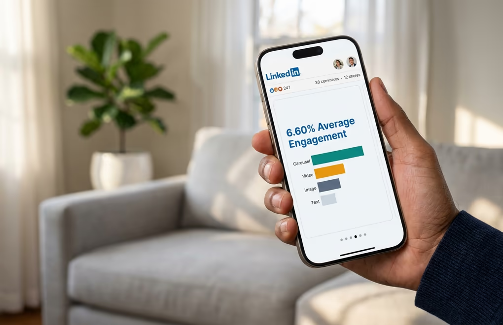
According to engagement benchmarks tracked across millions of posts, LinkedIn carousels now average a 6.60% engagement rate, blowing past single images at 4.85%, video at 5.60%, and text-only posts that often struggle to crack 2%. For creators and businesses trying to grow their presence on the platform, those numbers are impossible to ignore. A single well-crafted carousel can generate more meaningful engagement than a week of traditional text posts, and the compound effect of saves and shares means your content keeps working for you long after you hit publish.
The reason carousels work so well comes down to how the LinkedIn algorithm measures value. Every swipe through a slide counts as an engagement signal, and the time someone spends reading your carousel - what LinkedIn calls dwell time - is one of the strongest ranking factors in 2026. A carousel that holds attention for 60 seconds will dramatically outperform a text post that gets scrolled past in three. LinkedGrow's carousel generator was built specifically for this reason: to help you create carousels that capture and hold that attention without needing a design degree or hours of your time.
This guide covers everything you need to know about creating LinkedIn carousels that actually perform. You will learn which formats get the most saves, how to design slides that look professional even if you have never opened a design tool, how to write copy that keeps people swiping, and how to build a sustainable carousel strategy that fits into your broader content plan. Whether you are a solopreneur building your personal brand or part of an agency managing multiple clients, the tactics here are backed by real data and tested by creators who have made carousels a cornerstone of their LinkedIn growth.
Why do LinkedIn carousels outperform every other format?
The engagement gap between carousels and other LinkedIn formats is not small - it is a chasm. When Buffer ran a dedicated experiment posting carousels daily for an entire week and comparing the results to their usual mix of text and image posts, the numbers were staggering: carousels tripled their impressions and more than tripled their engagements compared to the previous week. That kind of lift from a single format change is almost unheard of in content marketing, and it reflects something fundamental about how people interact with swipeable content. Each slide transition represents a micro-commitment from the reader, and those micro-commitments add up fast in the algorithm's eyes.
The primary reason carousels dominate is dwell time, which has become one of LinkedIn's most important ranking signals. When someone opens your carousel and swipes through ten slides, they might spend 45 seconds to two minutes with your content. Compare that to a text post that gets read in eight seconds or a single image that gets glanced at for three. Research from the LinkedIn algorithm analysis community shows that posts generating 61 or more seconds of dwell time average a 15.6% engagement rate, while posts with under three seconds of dwell time see just 1.2%. Carousels naturally push you into that higher bracket simply because of the format.
LinkedIn has also added Saves and Sends as visible metrics in 2025 and 2026, and both heavily influence how the algorithm distributes your content. When someone saves your carousel, it tells LinkedIn this content has lasting reference value. When someone sends it as a direct message, it signals the content is worth sharing privately - which LinkedIn considers an even stronger endorsement than a public like or comment. Carousels naturally generate both signals because they package actionable information into a format people want to revisit and share with colleagues, and that creates a compounding distribution effect where the LinkedIn algorithm keeps pushing your carousel to wider audiences the more saves and sends it collects.
There is one important clarification worth making here because it trips people up. When creators talk about LinkedIn carousels in 2026, they are referring to PDF document posts, not the native image carousel feature that LinkedIn briefly tested and then removed in December 2023. The PDF document format was never affected by that change, and it remains the powerhouse format that delivers these engagement numbers. You create your slides as a PDF, upload it as a document post, and LinkedIn renders each page as a swipeable slide in the feed. The format is simple, reliable, and far more effective than photo posts or video for the majority of LinkedIn creators.
Which 7 carousel formats drive the most engagement?
Not all carousels are created equal, and the format you choose matters as much as the content inside it. After analyzing thousands of high-performing LinkedIn carousels, certain formats consistently rise to the top across industries and audience sizes. Here are seven that deliver the strongest engagement, saves, and shares in 2026.
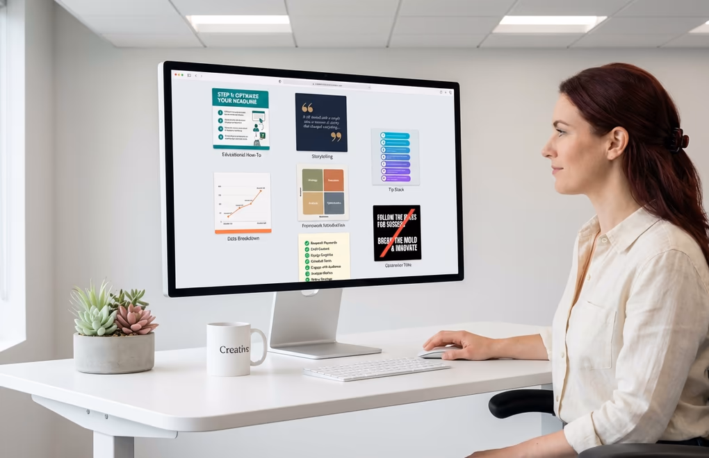
The Educational How-To
This is the most reliably high-performing carousel format on LinkedIn, and for good reason. When you teach someone a specific skill or process through a carousel - say, how to write cold emails that actually get responses, or how to structure a quarterly business review - you create content that people save for reference and send to their teams. Each slide walks through a step, building on the previous one, which naturally keeps people swiping. The best educational carousels are hyper-specific rather than broad, covering one narrow topic deeply instead of trying to summarize an entire field in ten slides.
The Storytelling Narrative
Storytelling carousels follow a narrative arc across slides: a problem, a turning point, insights gained, and actionable lessons. What makes this format powerful is that readers get emotionally invested in the outcome and will swipe through every slide to see how the story ends. The strongest versions are personal - a founder sharing how they nearly ran their startup into the ground before discovering one key insight, or a marketer revealing the campaign that flopped and what they would do differently. Authenticity drives engagement here, and the carousel format gives you the space to tell that story without competing for attention in a wall of text.
The Tip Stack
Tip carousels dedicate one actionable tip per slide, usually covering a theme like "8 mistakes killing your LinkedIn engagement" or "10 tools every freelancer should be using." The numbered format creates a natural curiosity loop where readers want to see all the tips, which drives completion rates up. The key to making this format work well is ensuring each tip stands on its own and delivers genuine value. If your tips are generic or obvious, people stop swiping at slide three. If each slide makes them think "I did not know that," they will swipe through every single one and probably save it for later.
The Data Breakdown
If you have access to interesting data - whether from your own business, industry reports, or publicly available research - packaging it into a carousel is one of the fastest ways to earn credibility and shares on LinkedIn. Each slide presents a single data point or chart with a clear takeaway, making complex information digestible and shareable. Data carousels perform especially well in B2B circles where professionals are hungry for benchmarks and trends they can reference in their own work, and they tend to get saved at much higher rates than other formats because people treat them as reference material.
The Framework Introduction
Frameworks and mental models are catnip for LinkedIn audiences, and carousels are the perfect delivery mechanism. When you introduce a reusable framework - a decision matrix, a hiring process, a content planning system, a prioritization method - people save it because they want to apply it in their own work. The carousel format lets you introduce the framework on slide one, break down each component across subsequent slides, and show how to apply it on the final slides. This format generates some of the highest save rates on the platform because it gives people a tangible tool they can screenshot and use immediately.
The Checklist
Checklist carousels thrive because they offer instant utility. Whether it is a pre-launch checklist for a SaaS product, a LinkedIn profile audit, or a monthly content review process, the checkbox format makes readers feel like they are getting a ready-made tool. Each slide presents a section of the checklist with enough context to understand why each item matters. People screenshot these, share them with their teams, and come back to them repeatedly. If you are a content creator looking for a format that consistently drives saves, checklists are one of your safest bets.
The Contrarian Take
Sometimes the highest-engagement carousel is the one that challenges conventional wisdom. Contrarian carousels open with a provocative statement - "Stop posting on LinkedIn every day" or "Your content calendar is hurting your growth" - and then systematically build a case across the slides. This format generates massive comment engagement because people either strongly agree or want to debate the point, and that comment activity signals the algorithm to push the carousel to a much wider audience. The trick is having genuine substance behind the contrarian take. A provocative headline with weak reasoning underneath will get clicks but destroy your credibility.
How do you design professional carousels without a designer?

One of the biggest misconceptions about LinkedIn carousels is that you need to be a graphic designer to make them look good. You really do not. The highest-performing carousels on the platform tend to be clean and simple rather than heavily designed, and the most important design decisions come down to a handful of technical choices that anyone can learn in an afternoon.
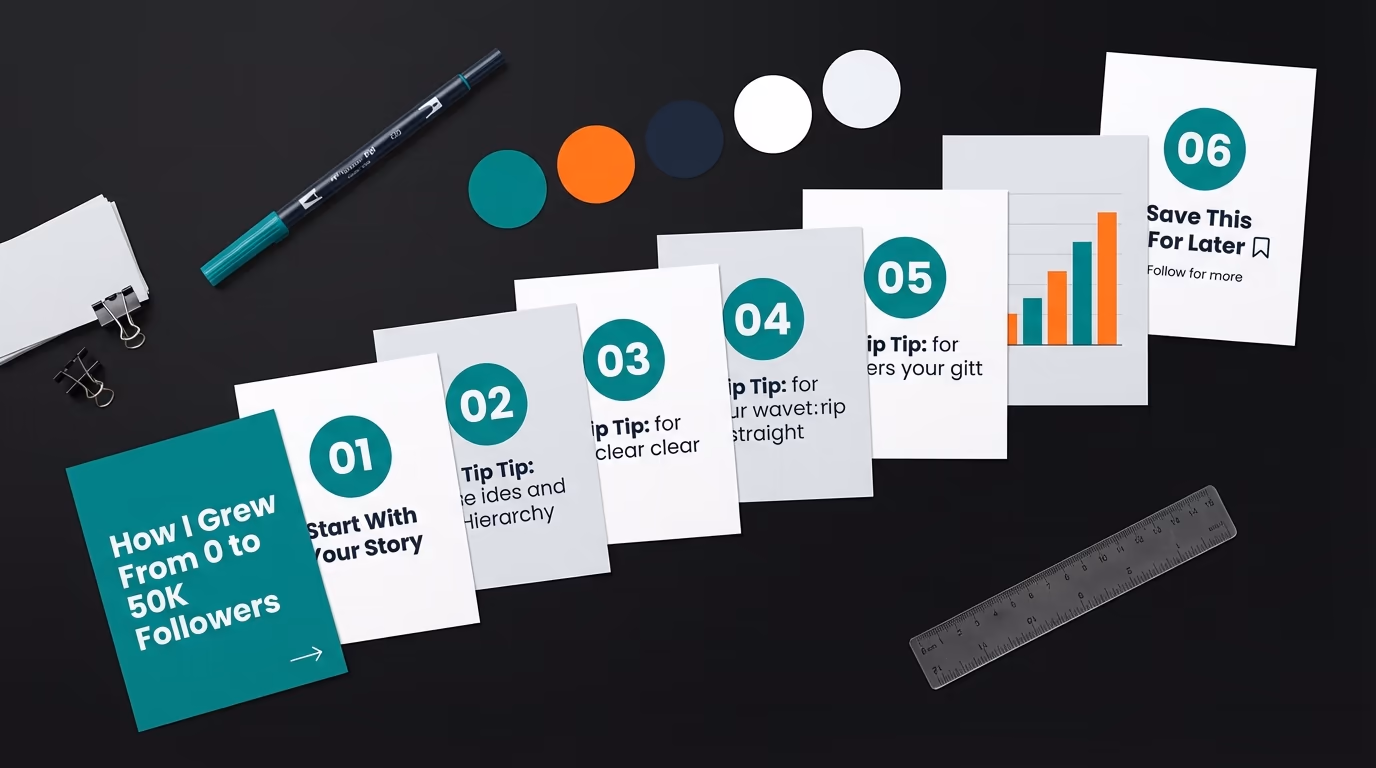
Start with your dimensions, because getting this wrong affects everything else. The optimal carousel size is 1080 x 1350 pixels in portrait orientation, which gives you a 4:5 aspect ratio that takes up the maximum amount of screen space on mobile devices. Since over 60% of LinkedIn usage happens on phones, designing for mobile first is not optional - it is essential. Square slides at 1080 x 1080 also work well, but the portrait format gives you roughly 25% more visual real estate in the feed, which means more room for your content and a bigger visual footprint that stops the scroll. Whichever dimensions you choose, keep every slide consistent because LinkedIn applies the first slide's dimensions to the entire deck.
Typography is where most amateur carousels fall apart, and the fix is simpler than you might expect. Use a minimum of 24-point font for body text and 40 to 60-point font for headings. Anything smaller becomes unreadable on mobile, and if people have to pinch and zoom to read your slides, they will just keep scrolling instead. Stick to two fonts maximum throughout the entire carousel - one for headings and one for body text - and choose clean sans-serif typefaces that render well on screens. Bold sans-serifs like Inter, Poppins, or Montserrat for headings paired with a readable body font will give your carousels a polished look without any design expertise.
Color and contrast deserve more attention than most people give them. High-contrast combinations like dark text on a light background or white text on a deep navy or black background are the safest choices because they are universally readable. If you want to add brand colors, use them for accents and highlights rather than large background areas where they might reduce readability. Avoid red-green combinations entirely as they are invisible to a significant portion of people with color vision differences, and keep your palette to three or four colors total. Consistent brand colors across every carousel you publish help readers recognize your content instantly in the feed, which builds trust and familiarity over time.
The number of slides you include has a direct, measurable impact on your reach. The sweet spot is 6 to 12 slides, and the data is clear on this. Carousels with fewer than 5 slides see their reach drop by roughly 35% because LinkedIn's algorithm does not consider them substantial enough to distribute widely. On the other end, anything above 15 slides sees completion rates decline as readers lose patience before reaching your call to action on the final slide. If your content naturally fits into 8 to 10 slides, you are in the optimal range where engagement and completion rates both stay high.
How do you write carousel copy that keeps people swiping?

A beautifully designed carousel with weak copy will still underperform, because design gets someone to stop scrolling but words are what keep them swiping. The copywriting principles for LinkedIn carousels are different from writing a regular text post or a blog article, and understanding those differences is what separates carousels that get 50 engagements from ones that get 500.
Your first slide is the single most important element in the entire carousel. It functions as your hook, your headline, and your thumbnail all at once. When someone sees your carousel in the feed, they see the first slide alongside your caption, and they decide in roughly two seconds whether to start swiping or keep scrolling. The best first slides use a clear, benefit-driven headline that tells the reader exactly what they will gain by swiping through. Something like "The 5-step framework I use to close $10K deals from LinkedIn" works because it promises specific, tangible value. Vague titles like "My thoughts on sales" do not, because they give no reason to invest time in swiping. If you struggle with writing compelling hooks, LinkedGrow's hook generator can give you tested opening lines that are proven to stop the scroll.
On the interior slides, the golden rule is one idea per slide with two to three short sentences maximum. Every slide should make exactly one point, make it clearly, and make the reader want to know what comes next. You are not writing paragraphs here - you are writing cards, and each card needs to carry its own weight while building toward a larger narrative. If you find yourself cramming multiple concepts onto a single slide, that is a sign you need more slides, not more text per slide. White space is your friend in carousel design, and slides that breathe are far more readable on mobile than slides packed with information.
The transition between slides matters more than most creators realize. Each slide should end with something that creates a reason to swipe - a question, a partial reveal, a setup for the next point. You do not need to be heavy-handed with "swipe for more" arrows on every slide, although a subtle visual cue on the first two slides helps readers understand the format is interactive. What works better is writing each slide so the idea feels slightly incomplete without the next one, which keeps the curiosity loop open and maintains the swiping momentum that the algorithm rewards.
Your final slide is the second most important after the first, and it needs a clear call to action. This is where you tell readers what to do next: save the carousel for reference, share it with their team, comment with their take, follow you for more, or visit a link in your bio. The highest-performing CTAs ask a specific question that invites comments, because comment volume is one of the strongest engagement signals on LinkedIn. Something like "Which of these frameworks are you going to try first? Drop a number in the comments" gives people an easy, low-friction way to engage that feels natural rather than forced.
Do not forget about the caption that accompanies your carousel in the feed. Your caption should complement the carousel content, not repeat it. Use the caption to set context, share a personal angle on the topic, or pose a question that frames the carousel as the answer. A strong opening hook in your caption can be the difference between someone pausing to look at your first slide and scrolling right past it.
How do you build a carousel content system that scales?
Creating one great carousel is a skill. Creating a steady stream of them week after week without burning out is a system. The creators who consistently grow their LinkedIn following with carousels have all built some version of a repeatable process that turns ideas into polished slides without requiring hours of work each time, and the good news is that system is surprisingly straightforward to set up.
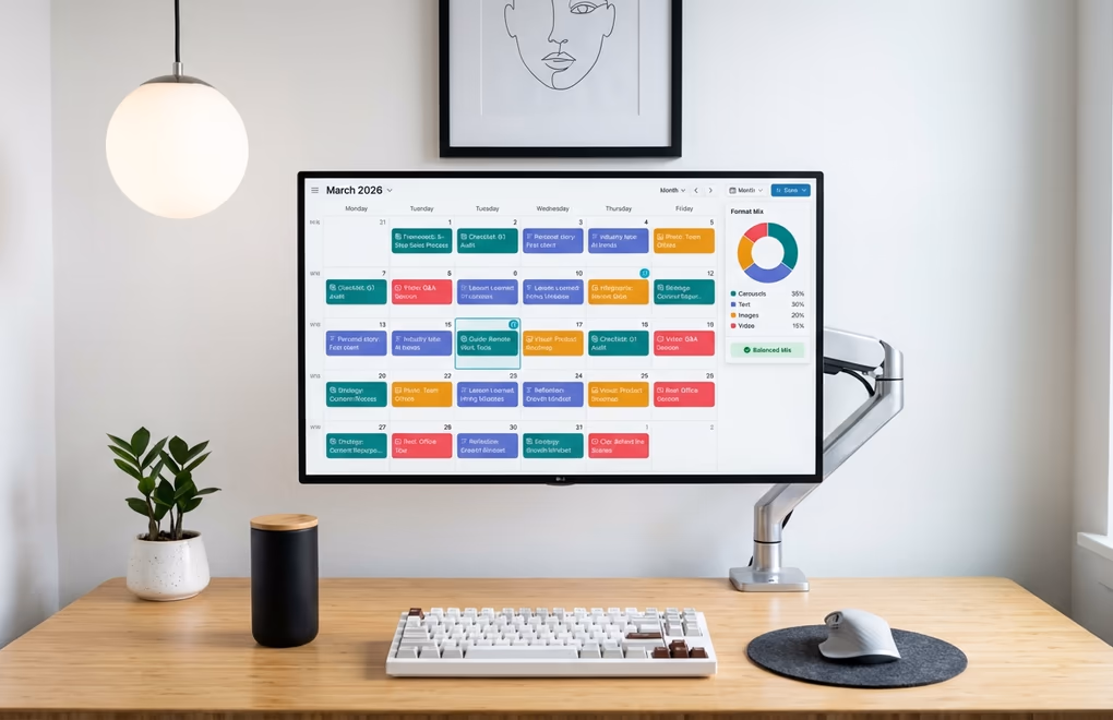
Format diversity is the first rule of a sustainable carousel strategy. This might sound counterintuitive given everything we have covered about carousels outperforming other formats, but the LinkedIn algorithm actually penalizes repetition. If you post three carousels in a row without mixing in other content types, your reach starts declining because the algorithm interprets format repetition as lower-quality content. The ideal rhythm is one to two carousels per week interspersed with text posts, single images, and the occasional video. A content calendar makes this easy to visualize and plan, letting you see your format mix at a glance and adjust before you end up with three carousels queued back to back.
One of the most efficient ways to produce carousels consistently is to repurpose content you have already created. That blog post you spent two days writing contains enough material for three or four carousels. A podcast episode can be distilled into its key takeaways and packaged as a tip stack carousel. Client case studies become storytelling carousels. Conference talks become framework introductions. When you start viewing every piece of long-form content as raw material for multiple carousels, you never run out of ideas and you extract far more value from the work you have already done. The content repurposing approach is particularly powerful for busy professionals who cannot dedicate hours to original carousel creation every week.
Batching your carousel production saves enormous amounts of time compared to creating them one at a time. Set aside two to three hours once per week or every two weeks and create four to six carousels in a single session. Having a consistent template with your brand colors, fonts, and layout means you only need to swap in the content for each new carousel rather than designing from scratch every time. This approach lets you queue up two weeks of carousel content in a single sitting, freeing up the rest of your time for engaging with your audience and doing the work that actually earns you material worth posting about.
Testing and iteration should be part of your system from day one. Track which carousel formats, topics, and slide counts get the best engagement, saves, and shares for your specific audience. What works for a SaaS founder talking about product strategy will be different from what works for a recruiter sharing hiring tips, and you will only discover your winning formula through experimentation. Pay attention to completion rates, which tell you whether people are swiping through to your final slide and CTA. If readers consistently drop off at slide six of your twelve-slide carousels, that is a signal to either make your content more compelling in the middle slides or to trim your carousels down to a tighter format. LinkedGrow's analytics dashboard gives you exactly this data so you can refine your approach based on what actually resonates.
Your Best Content Already Has a Carousel Inside It
Every piece of expertise you have, every lesson you have learned the hard way, and every process you have built in your career has the potential to become a carousel that reaches thousands of people on LinkedIn. The format is not complicated, the design requirements are approachable, and the engagement data makes the case overwhelmingly clear: carousels are the format to invest in if you want your LinkedIn content to get saved, shared, and distributed to audiences far beyond your existing network. The gap between people who know about carousels and people who actually create them consistently is where the opportunity lives, and the creators who build a system around carousel production are the ones who will see compounding growth throughout 2026 and beyond.
If building carousels from scratch still feels like too much friction, LinkedGrow's AI carousel generator handles the heavy lifting for you. Give it a topic or paste in existing content, and it produces a polished, swipeable carousel using your own AI key through the BYOK model, so you get unlimited generations without monthly caps or per-carousel fees. Combine that with AI image generation for custom slide visuals and scheduling to queue your carousels at optimal times, and you have a complete carousel content system that runs on a few dollars a month in API costs instead of an expensive monthly subscription. Get started for free and publish your first carousel today.
Looking for a quick way to create carousels without design tools? Try our AI carousel generator for LinkedIn - it turns any topic into professional, swipeable slides in seconds, no Canva required.
Frequently Asked Questions
The best dimensions for LinkedIn carousels are 1080 x 1350 pixels in portrait (4:5) orientation, which takes up maximum screen space on mobile. Square 1080 x 1080 also works well. Export your carousel as a PDF file under 100 MB, and keep all slides at the same dimensions since LinkedIn applies the first slide’s size to the entire deck.
Research shows 6 to 12 slides is the sweet spot for LinkedIn carousels. Below 5 slides, your reach drops by roughly 35% because the algorithm sees too little content to engage with. Above 15 slides, completion rates fall significantly as readers lose interest before reaching your call to action.
Yes. LinkedIn removed its native beta carousel feature in December 2023, but the PDF document post format was never affected. When people say LinkedIn carousel in 2026, they mean a multi-page PDF uploaded as a document post. Each page becomes a swipeable slide that readers navigate through in the feed.
Absolutely. Document posts work on both personal profiles and LinkedIn company pages. Company page carousels perform especially well for product announcements, team spotlights, and educational series because they combine brand visibility with the high engagement that carousels naturally generate.
One to two carousels per week works well for most creators. Posting three or more carousels in a row actually decreases your reach because LinkedIn rewards format diversity. Mix carousels with text posts, single images, and videos to keep the algorithm distributing your content to a wider audience.