

LinkedIn carousel posts are the highest-engagement format on the platform, and they're surprisingly underused. The swipe mechanic keeps people on your post longer than any other content type, which tells the algorithm to push it to more feeds. Despite that, fewer than 2% of LinkedIn posts use the carousel format, which means less competition for attention and more room for your content to stand out.
The process for posting a carousel on LinkedIn isn't complicated, but it has a few non-obvious steps that trip people up. LinkedIn doesn't call them "carousels" in the interface, there's no dedicated carousel button, and the feature is buried behind the document upload option that most people have never clicked. Once you know where to find it and what file format to use, the entire process takes under a minute.
This article covers everything from the exact dimensions your slides should be to the step-by-step upload process on desktop and mobile. You'll also learn how to design slides that people actually want to swipe through, and how to write captions that turn those swipes into comments, follows, and saves. LinkedGrow is a LinkedIn content platform with a built-in carousel generator that handles the design and PDF export for you, but the upload steps and strategies below work regardless of how you create your slides.
Whether you're posting your first carousel or your fiftieth, the formatting details in this article will help you avoid the common mistakes that make carousels look blurry, get cropped wrong, or underperform in the feed. Getting the technical pieces right is the foundation, and the creative strategy on top of that foundation is what separates carousels that get saved and shared from ones that people scroll past.
What is a LinkedIn carousel post and why does it outperform?
A LinkedIn carousel post is a multi-page document that appears in the feed as a set of swipeable slides. You upload a PDF, PowerPoint, or Word file, and LinkedIn converts each page into a slide that viewers can swipe through left to right. The format looks similar to Instagram carousels, but on LinkedIn it's technically a document post rather than a native carousel feature.

The reason carousels outperform other formats comes down to dwell time. When someone starts swiping through your slides, they spend more time on your post than they would reading a text post or glancing at a single image. LinkedIn's algorithm interprets that extended time as a strong signal that the content is worth showing to more people. Each swipe is essentially a micro-vote of interest, and a full swipe-through tells the algorithm that this post deserves wider distribution.
Carousels also generate more saves than any other format on LinkedIn. People save posts they want to reference later, and the structured, slide-by-slide layout of a carousel makes it easy to return to specific information. If you're sharing a framework, a checklist, a comparison, or a step-by-step process, the carousel format naturally lends itself to saving because each slide contains a discrete, digestible piece of information. You can explore different LinkedIn carousel templates to see which structures work best for your audience.
The other advantage is visual real estate. A carousel occupies significantly more space in the feed than a text post or even a single image. The first slide acts as a cover, and the visible edge of the second slide creates a visual cue that there's more content to discover. That combination of large format and implied depth makes people more likely to stop scrolling and start engaging with your content.
What are the right dimensions and file specs for LinkedIn carousels?
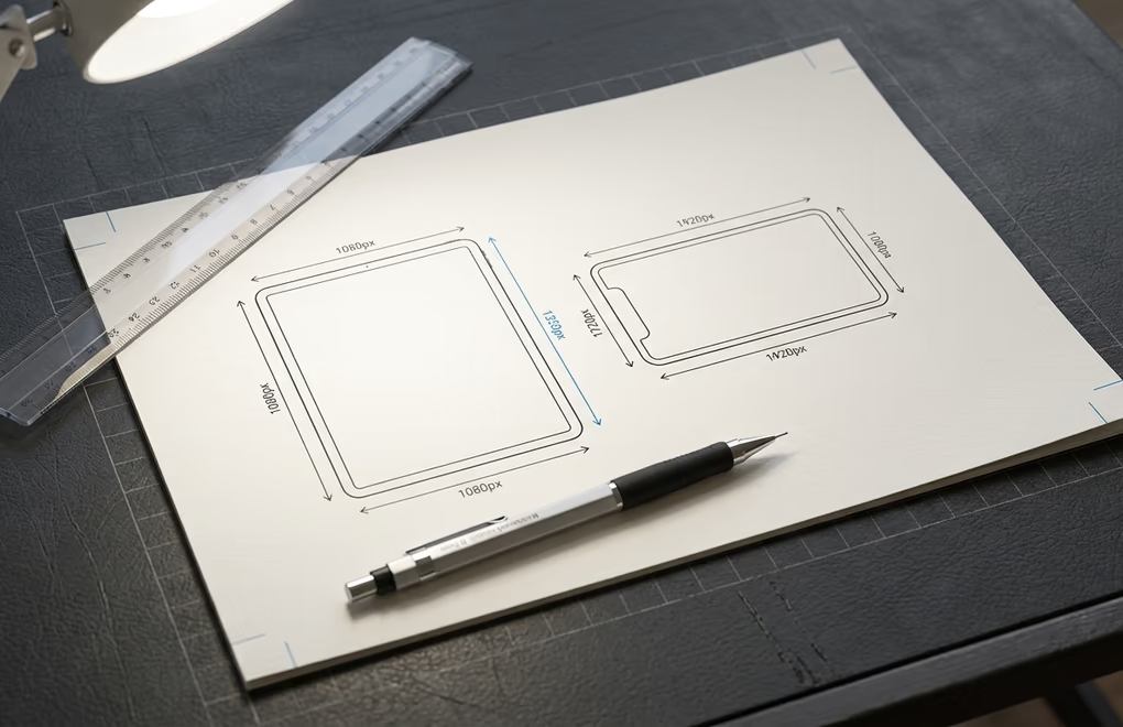
The best dimensions for LinkedIn carousel slides are 1080 x 1350 pixels in portrait orientation (4:5 aspect ratio). This size takes up the maximum vertical space in the mobile feed, which is where the majority of LinkedIn users browse. Square slides at 1080 x 1080 pixels also work well and are a solid choice if your content reads better in a balanced layout, but portrait gives you about 25% more screen real estate on mobile devices.
LinkedIn accepts PDF, PPTX, and DOCX files for carousel uploads. PDF is the best choice because it preserves fonts, colors, and layout exactly as you designed them, with no rendering surprises across different devices. PowerPoint files sometimes shift slightly when LinkedIn converts them, and Word documents lose precise formatting almost every time. If you design in Canva, Figma, or any other tool, always export to PDF before uploading to LinkedIn.
The file size limit is 100 MB, and LinkedIn allows up to 300 pages per document. In practice, you'll never need anywhere near those limits. Most carousels are 8 to 12 slides, and a well-exported PDF of that length is typically 1 to 3 MB. Keeping the file under 3 MB ensures that your slides load quickly for viewers on slower connections and avoids compression artifacts that can blur text and graphics. For a complete reference on every LinkedIn image and media format, check the LinkedIn image sizes tool.
One important detail about text sizing: design your slides as if they'll be viewed on a phone screen, because that's where most of your audience will see them. Body text should be at least 24 points, and headlines should be 36 points or larger. Text that looks perfectly readable on your laptop screen during the design process can become unreadable on a 6-inch phone display if the font size is too small. Test your PDF on your phone before uploading, and zoom out on your design tool to simulate the mobile viewing experience.
How do you create a LinkedIn carousel from scratch?
Creating a LinkedIn carousel starts with deciding on the content structure before you open any design tool. The most effective carousels follow a clear narrative arc: a hook slide that stops the scroll, a series of content slides that deliver value one point at a time, and a final slide with a call to action. Think of your carousel as a short presentation where every slide earns the right to the next swipe.
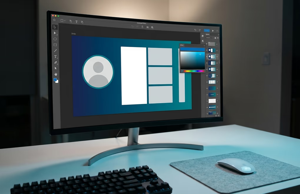
Start by outlining your slides in a text document or note-taking app. Write a one-sentence summary of what each slide will communicate, starting with the hook and ending with the CTA. This outline is where you shape the flow and catch structural problems like too many slides on one subtopic or a missing transition between sections. Most carousels work best with 8 to 12 slides total: 1 hook, 6 to 9 content slides, 1 CTA, and optionally a "share/save this" slide at the end.
For the design itself, you have several paths. Canva and Figma both have LinkedIn carousel templates that set the dimensions and grid for you, which saves time if you're comfortable with those tools. The LinkedGrow carousel generator takes a different approach: you write your text and pick a template, and the tool handles the layout, branding, and PDF export automatically. That workflow is faster if you want to produce carousels regularly without designing every slide from scratch.
Regardless of the tool you choose, keep these design principles in mind. Use large, readable fonts because most viewers are on mobile devices. Stick to two fonts maximum, typically one for headlines and one for body text. Use your brand colors consistently across every slide so the carousel feels cohesive as people swipe through it. Leave enough white space around text blocks so the slides don't feel cramped, and remember that LinkedIn crops a few pixels from the edges on some devices, so keep important elements away from the very edge of the slide.
The hook slide deserves extra attention because it determines whether anyone swipes at all. Your first slide is essentially a billboard in someone's feed, and it needs to communicate the carousel's value proposition in under two seconds. A strong hook slide uses a bold, specific headline (like "7 Caption Formulas That Get Comments" rather than "Tips for Better Posts") and minimal visual clutter. Pair it with a strong opening line in your caption and you have two hooks working together to stop the scroll.
How do you upload and post a carousel on LinkedIn?
Once your PDF is ready, the upload process is straightforward on both desktop and mobile. The button you need is labeled "Add a document" in the post composer, and it's sometimes hidden behind a "more" menu depending on your screen size. Here's how it works on each platform.
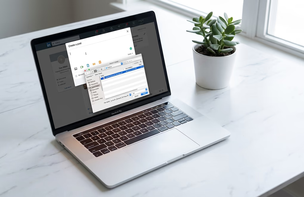
On desktop, open linkedin.com and click "Start a post" in the post composer at the top of your feed. In the row of icons at the bottom of the composer, look for the document icon (it looks like a page with a folded corner) or click the three-dot menu if you don't see it. Click "Add a document", select your PDF from your computer, and wait for it to upload. LinkedIn will show you a preview of the first slide so you can confirm everything looks right.
After the file uploads, LinkedIn asks you to add a document title. This title appears above the carousel in the feed as a clickable header, separate from your post caption. Make it specific and benefit-driven rather than leaving it as the default filename. For example, "7 LinkedIn Hook Formulas That Actually Work" is better than "carousel-final-v3.pdf". A good document title can be the difference between someone swiping through your carousel or scrolling past it.
On mobile, tap the post button (the plus icon or the "Post" button depending on your app version), then look for the document icon in the attachment options. On some versions of the LinkedIn app, you may need to tap "More" or the three-dot icon to find it. Select your PDF from your phone's file system or cloud storage, add the document title, write your caption, and publish. The mobile upload experience is a bit less polished than desktop, but the end result in the feed looks identical. If you plan to post carousels regularly from mobile, keep your finished PDFs in a cloud folder (Google Drive, iCloud, or Dropbox) so they're easy to find when you're ready to post.
You can also schedule carousel posts ahead of time using third-party tools. LinkedIn's native scheduler doesn't support document post scheduling as of 2026, which means you need an external platform if you want to batch-create carousels and queue them for specific dates and times. LinkedGrow's post scheduling feature handles this by letting you create the carousel, write the caption, pick a publishing time, and forget about it. The post goes live at the time you set without you needing to be online.
What makes a strong carousel caption and CTA?
The caption is just as important as the slides themselves because it's the first thing people read before they decide to swipe. A carousel with beautiful slides and a weak caption will underperform, and a mediocre design with a strong caption will often outperform it. The caption sets the context, builds curiosity, and tells people why they should invest their time in swiping through all your slides.

Your caption's first line is your hook, and it needs to work within the roughly 210-character preview that LinkedIn shows before the "see more" truncation. Don't waste that space with vague setups or generic statements. Open with something specific that creates a reason to keep reading: a surprising number, a direct question that your audience faces, or a concrete promise of what they'll learn from the carousel. If you need help with hooks, the LinkedIn hook examples and formulas article covers 15 structures that consistently perform well.
After the hook, use the rest of the caption to add context that the slides don't cover. Think of the caption as the "behind the scenes" companion to the carousel: why you created it, who it's for, or a personal angle on the topic. Repeating what's already on the slides is a waste of the caption space. Instead, give people a reason to both swipe AND read the caption, because that double engagement sends even stronger signals to the algorithm.
For the call to action, you have two primary options: ask people to comment or ask them to save the post. A comment-driving CTA works best for carousels that present an opinion, comparison, or ranked list, because people naturally want to share their own perspective. A save-driving CTA works best for reference content like checklists, frameworks, and templates, because people want to come back to it later. You can also encourage shares by adding "tag someone who needs this" on your final slide, but use that sparingly because overuse makes it feel like engagement bait.
One more formatting detail: don't put links in the carousel caption if you can avoid it. External links in the caption suppress your post's reach because LinkedIn's algorithm deprioritizes content that sends users away from the platform. The workaround is to put your link in the first comment instead, and mention on your final slide and in the caption that the link is "in the comments below". This approach keeps your reach intact while still giving interested viewers a way to click through. For more on LinkedIn post formatting best practices, that article covers hashtags, line breaks, and other structural elements that affect how your post performs.
Build LinkedIn carousels faster with LinkedGrow
If you want to post carousels regularly without spending 30 to 60 minutes designing each one, LinkedGrow has a carousel generator built specifically for LinkedIn. You write your content (or let AI draft it using your trained voice), pick a template, customize the colors and fonts to match your brand, and export a ready-to-post PDF in minutes. The tool handles the dimensions, the layout, and the file format so you can focus on the content and strategy rather than fighting with design software.
LinkedGrow also lets you generate AI images for individual carousel slides, schedule the finished carousel for the optimal posting time, and track its performance alongside your other LinkedIn content. Because the platform uses BYOK (bring your own AI key), you connect your own API keys from providers like OpenAI or Google and pay the API costs directly, which typically comes to $2 to $4 per month for regular use. There's a 7-day Pro trial with full access to the carousel generator and every other feature, everything included.
The combination of AI-assisted content creation, a visual carousel editor, and built-in scheduling means you can go from idea to published carousel in under 10 minutes. For creators, coaches, agencies, and small businesses that want to post carousels consistently without the design overhead, that speed difference adds up fast across weeks and months of content production.
Frequently asked questions about LinkedIn carousel posts
PDF is the best format for LinkedIn carousel posts. LinkedIn converts each page of the PDF into a swipeable slide with sharp text and smooth transitions. You can also upload PPTX and DOCX files, but PDFs produce the most consistent rendering across devices. Keep the file under 100 MB (LinkedIn's limit), and ideally under 3 MB to avoid compression artifacts that blur text and graphics.
The best-performing LinkedIn carousels use 8 to 12 slides. Fewer than 5 slides tends to produce less dwell time, which limits algorithmic distribution. Going past 15 slides can work for in-depth guides, but you risk drop-off if the content doesn't hold attention through every swipe. Start with 8 to 10 slides and adjust based on your topic depth.
Yes. Open the LinkedIn app, tap the post button, select the document icon (on some versions it appears under the three-dot menu), choose your PDF from your phone's files, add a document title, write your caption, and publish. The experience is slightly different on iOS and Android, but both support carousel uploads. Make sure your PDF is already on your phone or in a cloud storage app you can access from the file picker.
LinkedIn's official name for the feature is 'document post' because the platform treats the upload as a document (PDF, PPTX, or DOCX) and renders each page as a slide. The term 'carousel' comes from the user community and social media marketing world. LinkedIn had a native carousel format for ads years ago, and users applied the same name to document posts because the swipe-through experience looks identical. Both terms refer to the same feature.
LinkedIn does not support clickable links inside carousel slides. Any URLs you include in your PDF will appear as plain text, not as tappable links. The workaround is to put your link in the post caption or in the first comment, and reference it on your final slide with a CTA like 'grab the link in the first comment below'. Keeping links out of the slides is also better for reach because the algorithm doesn't penalize carousel posts the way it penalizes regular link posts.
The post you keep meaning to write takes four minutes here.
LinkedGrow turns a link, a video or a rough idea into a LinkedIn post written in your own voice, then puts it in the calendar for the morning your audience is awake.
Start free for 7 days