With LinkedIn analytics, the real question is which metrics actually matter. You can see impressions, reactions, comments, follower counts, and a dozen other numbers that change every time you publish something. The problem isn't access to data. The problem is that most of these numbers don't tell you whether your LinkedIn analytics are pointing toward growth or just making you feel productive while your account stays flat.
If you've ever posted something, watched it hit 5,000 impressions, and then wondered why your inbox stayed quiet and your follower count barely moved, you've experienced this firsthand. The numbers looked great on the surface, but nothing actually happened as a result. Meanwhile, someone else posted to a tenth of that audience and landed two client calls from it. The difference wasn't luck or timing. It was which metrics they were paying attention to and, more importantly, which ones they were ignoring.
This guide breaks down exactly which LinkedIn metrics are worth tracking, which ones you should stop obsessing over, and how to build a simple weekly routine that keeps you focused on the numbers that actually predict whether your content is working. Whether you're a solo creator trying to grow an audience or an agency managing multiple accounts with LinkedGrow's analytics tools, the framework is the same. Track less, understand more, and let the right data guide your next move instead of chasing every number LinkedIn throws at you.
What is the LinkedIn vanity metrics trap?
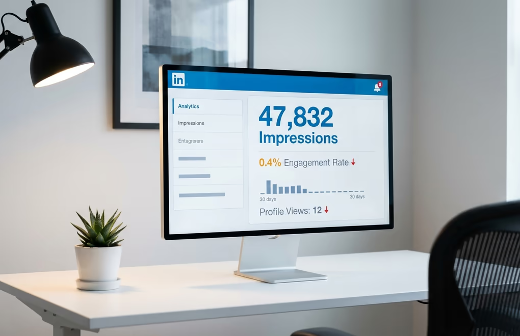
Impressions feel good. Watching that number climb after you publish a post creates a little dopamine hit that makes you think the content worked. But impressions only tell you that LinkedIn showed your post to people, not that anyone cared enough to stop scrolling. A post can rack up thousands of impressions while generating almost zero meaningful engagement, because LinkedIn counts an impression whenever your post appears on someone's screen for a fraction of a second. Somebody scrolling past your post at full speed still counts as an impression.
Likes have a similar problem. They're the lowest-effort interaction on the platform, and most people hand them out reflexively while scrolling. Getting 50 likes on a post feels validating, but it doesn't mean 50 people actually read what you wrote. Many of those likes came from people who saw your name, glanced at the first line, and tapped the reaction button without ever hitting "see more." That's not engagement in any meaningful sense. It's digital politeness.
The danger of vanity metrics isn't just that they're misleading. It's that they actively prevent you from improving. When you optimize for impressions, you start chasing broad topics and clickbait hooks that attract eyeballs but repel the specific people you actually want to reach. When you optimize for likes, you start writing feel-good content that everyone agrees with but nobody remembers ten minutes later. Both paths lead to the same place: a LinkedIn presence that looks active on paper but generates no real opportunities.
The fix isn't to ignore impressions and likes entirely. They have their place as context indicators. But they should never be the metrics you use to decide whether your content strategy is working. Think of them like the speedometer in a car. It tells you how fast you're going, but it doesn't tell you whether you're headed in the right direction. For that, you need a completely different set of instruments.
Which 5 LinkedIn metrics actually predict growth?
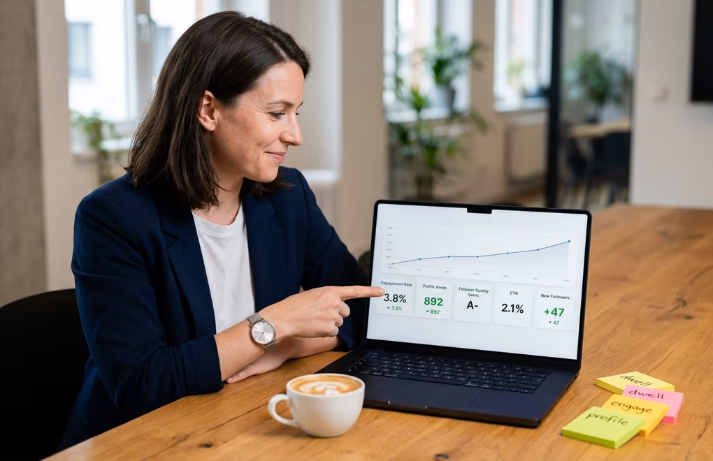
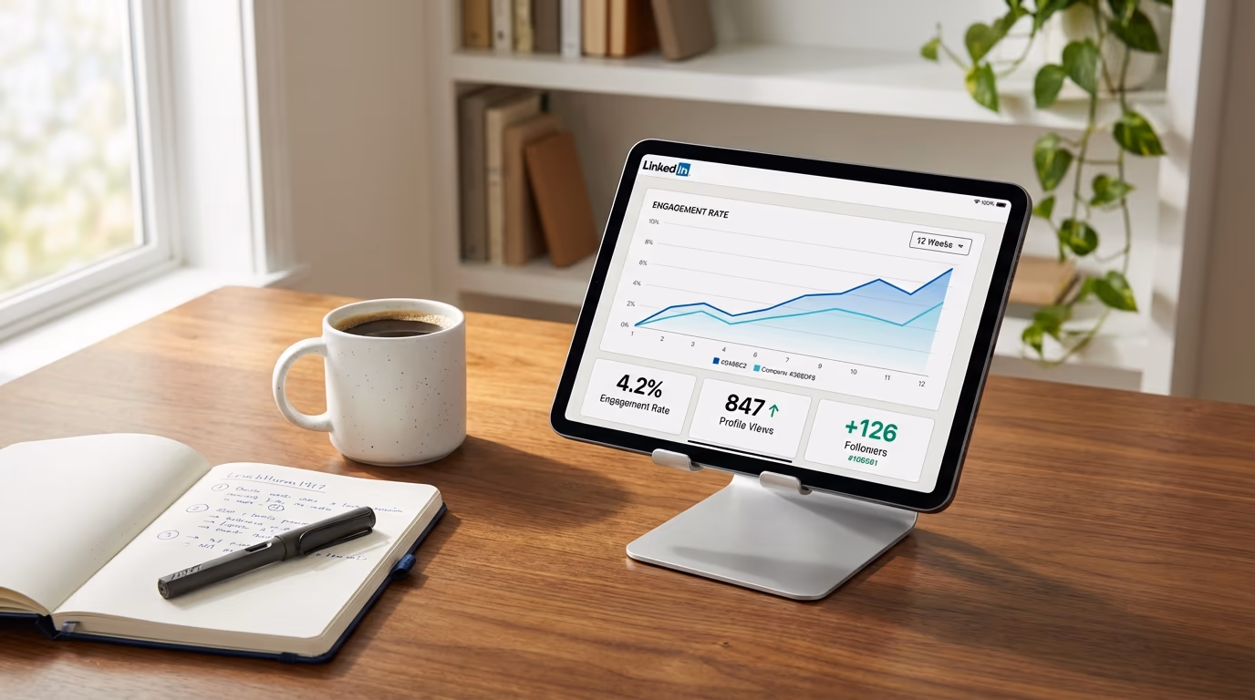
Engagement rate is the single most important number you should track on LinkedIn, and most people either calculate it wrong or don't track it at all. Your engagement rate tells you what percentage of the people who actually saw your post chose to interact with it, and that ratio matters far more than the raw numbers. A post with 500 impressions and a 6% engagement rate is outperforming a post with 5,000 impressions and a 0.3% engagement rate, because the first one resonated deeply with the people who saw it while the second one got distributed widely but connected with almost nobody. LinkedIn calculates this as total interactions divided by impressions, and an engagement rate above 2% is generally considered strong. You can calculate yours instantly with LinkedGrow's free engagement rate calculator.
Profile views from content is the metric that bridges the gap between posting and actual business results. When someone reads your post and then clicks through to your profile, they're telling you something powerful: your content made them curious enough to want to know who you are. LinkedIn now shows this at the post level, so you can see exactly which posts drive profile visits and which ones don't. A post that generates high profile views is doing what your content is supposed to do, converting attention into genuine interest in you as a person.
Follower quality is harder to quantify, but it matters enormously. LinkedIn's analytics show you the demographics of your followers, including their industries, job titles, seniority levels, and locations. If you're a B2B consultant targeting VP-level decision makers and your follower growth is coming from entry-level professionals in unrelated fields, your content is attracting the wrong audience regardless of how fast the numbers climb. Check your follower demographics monthly and compare them against your ideal reader profile. If there's a mismatch, your topics or tone need to shift.
Click-through rate matters whenever your posts include a call to action, whether that's a link to your website, a newsletter signup, or a resource download. LinkedIn tracks clicks separately from other engagements, and this metric tells you whether your audience trusts you enough to take the next step beyond reacting to your post. A post with high engagement but zero clicks means people enjoyed reading it but didn't feel compelled to do anything about it, which is entertainment rather than marketing.
Finally, followers gained per post is a metric LinkedIn added more recently, and it's surprisingly useful. It shows you which specific posts convinced new people to follow your account, which is a much stronger signal than a like or a comment. When someone follows you, they're saying they want to see more of what you create. Tracking which posts generate new followers tells you exactly which topics and formats your audience finds valuable enough to commit to.
What is LinkedIn dwell time and why does it matter?

There's one metric that influences your LinkedIn reach more than almost anything else, and LinkedIn doesn't show it to you anywhere in your analytics dashboard. Dwell time measures how long someone pauses on your post while scrolling through their feed. Not whether they liked it, not whether they commented, just whether they stopped moving long enough for LinkedIn to conclude that your content caught their attention. If you've read about how the LinkedIn algorithm works in 2026, you know that this signal plays a massive role in determining how far your posts travel.
LinkedIn's engineering team has published details about how this works. They track two types of dwell time: the time someone spends looking at your post while it's visible in their feed, and the time they spend on your content after clicking to expand or read more. Both signals feed into a model that predicts whether the next person who sees your post will skip it or engage with it. When LinkedIn's model predicts high engagement based on early dwell time patterns, it pushes your post to a wider audience. When the model predicts people will scroll past it, distribution slows down. You can read the technical details in LinkedIn's engineering blog if you want to understand the full methodology.
The practical implication is significant. A post that gets people to stop and read for 30 or 60 seconds, even if they don't leave a like, is sending stronger positive signals to the algorithm than a post that collects quick reactions from people who never actually read the content. This is why document posts and carousel formats tend to perform so well on the platform. They naturally hold attention longer because people swipe through multiple pages, and every second of that swiping registers as dwell time. It's also why strong opening hooks matter so much, because your first two lines determine whether someone pauses or keeps scrolling, and that initial pause is what kicks off the dwell time clock.
You can't see your dwell time numbers, but you can optimize for them. Write content that rewards reading, not just scanning. Use formatting that slows people down, like line breaks, bold text on key phrases, and questions that make the reader pause to consider their own answer. Create posts that people want to expand and read in full rather than posts that deliver everything in the first three lines. If your hooks are strong enough to stop the scroll, the dwell time will follow naturally.
How do you read LinkedIn analytics without getting overwhelmed?
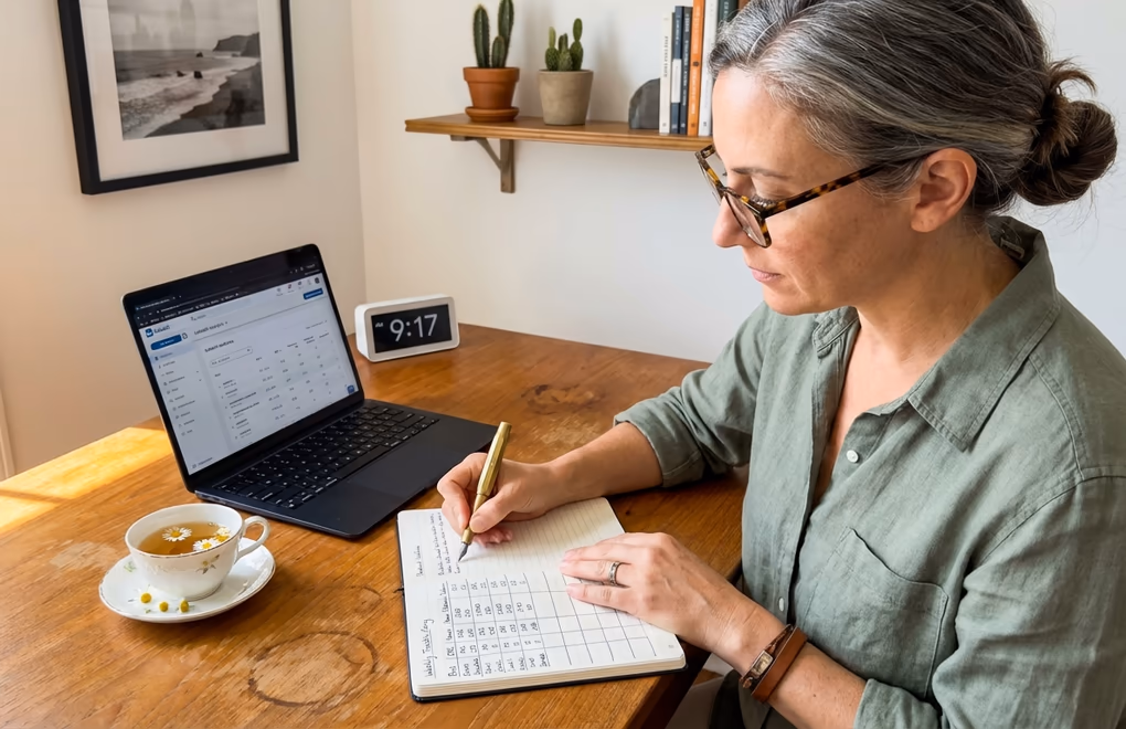
LinkedIn's native analytics interface gives you more information than most people realize, but it's organized in a way that makes it easy to miss what matters. The post-level analytics are where you should spend most of your time, and you get to them by clicking on the engagement summary below any post you've published. That summary line shows impressions, reactions, and comments as clickable numbers, and tapping on them opens a detailed view that breaks down exactly who interacted with your content.
The detail view shows you the job titles, companies, and locations of people who reacted to or commented on your post. This is incredibly useful information that most people glance at once and then forget about. If you're a coach and your post about leadership attracted reactions from three CMOs at mid-size companies, that's not just engagement, it's a warm audience segment you should pay attention to. If your post about productivity tips got 200 reactions from college students, that tells you something very different about who your content is reaching versus who you want it to reach.
Your profile's analytics dashboard, accessible from the "Analytics & tools" section on your profile page, provides a broader view. It shows profile views over time, search appearances, and post impressions across a rolling window. The profile views trend is especially worth watching because it correlates directly with content quality. When you publish posts that resonate with the right audience, profile views spike within 24 to 48 hours. When your content misses the mark, profile views stay flat even if impressions look decent.
LinkedIn also shows follower demographics in a separate tab, broken down by seniority, industry, location, company size, and job function. Review these monthly rather than weekly, since demographic shifts happen gradually and checking too often just creates noise. What you're looking for is alignment. If your ideal customer is a VP of Marketing at a technology company, your follower demographics should trend in that direction over time. If they're drifting toward a different demographic, it's a signal that your content topics need adjusting.
For content creators building a personal brand, the native dashboard works reasonably well for basic tracking. The limitations become more apparent for agencies managing multiple client accounts, where the inability to compare performance across time periods, the lack of useful export formats, and the disappearing historical data make dedicated analytics tools worth considering. But you should exhaust what the native dashboard offers before paying for anything extra.
What is the 15-minute weekly LinkedIn analytics routine?
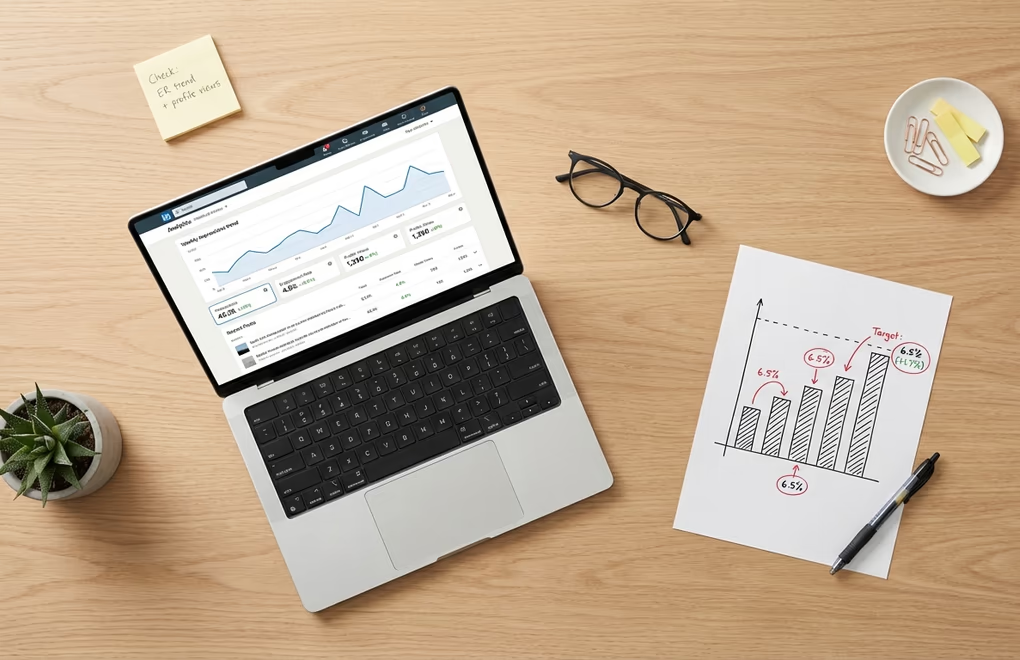
Checking your analytics daily is a waste of time. A single day's data tells you almost nothing useful because individual post performance is noisy and unpredictable. The post you spent two hours crafting might underperform for no apparent reason, while something you wrote in five minutes might take off. Day-to-day fluctuations are normal and reacting to them leads to erratic strategy changes that never get enough time to prove themselves. A weekly measurement routine gives you enough data to spot real patterns without drowning in noise.
Pick one day each week, ideally the same day, and spend 15 minutes on a focused review. Start by looking at every post you published that week and noting the engagement rate for each one. Not the impressions, not the total likes, just the engagement rate. Write these numbers down somewhere you can reference later, even a simple spreadsheet or a notes app works fine. After a month of doing this, you'll have a clear picture of your average engagement rate and you'll be able to spot which posts outperformed your baseline and which ones underperformed.
Next, check your profile views for the week and compare them to the previous week. If profile views spiked on certain days, cross-reference those days with the posts you published. You'll often find that your best-performing content in terms of profile views isn't the same content that got the most likes. The posts that drive profile views tend to be ones where you demonstrated specific expertise or shared a personal perspective that made people want to learn more about you. Identifying these posts is like finding a cheat code for your content strategy, because they show you exactly what topics position you as someone worth following.
Finally, look at the follower count and note the net change for the week. Don't obsess over small fluctuations since losing a few followers is normal and healthy, but track the overall trend. A steady upward trend means your content is consistently attracting the right people. A flat trend means you're maintaining but not growing, which usually signals that your content is too safe or too similar to what everyone else in your niche is posting. A declining trend means something needs to change, whether that's your posting frequency, your topics, or the way you're framing your expertise.
Once a month, zoom out and look at the bigger picture. Compare this month's average engagement rate to last month's. Check whether your follower demographics are shifting toward or away from your target audience. Review which content formats generated the most profile views. You can even run simple experiments using A/B testing to compare different hook styles, post lengths, or content angles, then use the monthly review to evaluate which experiments produced meaningful results.
Your Numbers Tell a Story - Start Listening
LinkedIn analytics don't have to be complicated. The people who get the most value from their data aren't the ones tracking every metric LinkedIn offers. They're the ones who picked a handful of numbers that connect directly to their goals, built a simple routine around checking them, and then actually used what they learned to make better content decisions week after week. Engagement rate, profile views, follower quality, click-through rate, and the invisible hand of dwell time. Those five metrics, tracked consistently, will tell you everything you need to know about whether your LinkedIn presence is growing or just existing. If you are also doing outreach or social selling, your Social Selling Index is another score worth checking weekly as a health metric for your prospecting activity.
If you want to go deeper, LinkedGrow's analytics dashboard tracks all of these metrics automatically, compares your performance across time periods, and highlights which posts drove the most meaningful engagement so you can create more content like them. Combined with AI-powered post generation that learns from your best performers, it turns your analytics data into a feedback loop that gets smarter every week. For a side-by-side comparison of LinkedGrow against other LinkedIn analytics tools, see how the dashboard stacks up.
Frequently Asked Questions
An engagement rate of 2% or higher is generally considered strong on LinkedIn. However, the best benchmark is your own historical performance rather than industry averages, since factors like audience size, niche, and content format all influence what counts as good for your specific account.
A weekly check of about 15 minutes is ideal for tracking post performance, engagement trends, and profile view patterns. Monthly reviews work better for bigger-picture analysis like follower growth trends, demographic shifts, and content strategy adjustments that require a larger data window to evaluate properly.
Dwell time measures how long someone pauses on your post while scrolling through their feed. LinkedIn uses this signal to determine whether your content is genuinely interesting or just taking up space. Higher dwell time tells the algorithm to show your post to more people, making it one of the most influential ranking factors.
High impressions with low engagement usually means LinkedIn showed your post to people who scrolled right past it. This often happens when your hook fails to grab attention, your content doesn't match your audience's interests, or you're reaching a broad but irrelevant audience through hashtags or viral reshares.
LinkedIn shows limited viewer information for posts. You can see total impressions, reactions, and comments with names attached, but you can't see everyone who viewed your post. Profile viewers are visible for the last 90 days on premium accounts, and LinkedIn now shows followers gained per post as a newer metric.